The Ecom Creative Swipe-File: 10 Patterns That Consistently Convert
Turn the strategy into creatives
Create Meta ads for your product
Paste your product page. ADEN'S LAB turns the offer, audience, and positioning into complete ready-to-use Meta static ads.
Free to try No prompt writing

Meta ads are all about the creative. Since Meta’s October 2025 "Andromeda" update, the algorithm now processes 10,000x more signals, making your ad content the single most important factor for success. If your ad doesn’t grab attention and convert, no targeting or budget tweaks will save it.
Here’s what you’ll find: 10 proven ad patterns that consistently deliver results across $100M+ in ad spend. These patterns take the guesswork out of ad testing, helping you create more effective ads faster. From emotional storytelling frameworks like Problem-Agitation-Solution to urgency-driven tactics like Discount Deadline Overlays, these strategies are built to stop the scroll and drive conversions.
Key Takeaways:
- Ad patterns outperform random testing by using psychological triggers that resonate with users.
- Formats like Before-After-Bridge visuals and Testimonial Transformation Stacks are structured to engage and convert.
- Creative fatigue is real. You’ll need fresh ad concepts regularly to maintain performance.
- Using AI tools for Meta ads like Aden’s Lab simplifies ad production, letting you quickly test variations without design bottlenecks.
The bottom line: These 10 patterns offer a reliable framework to create ads that perform. Whether you’re solving a problem, showcasing transformations, or creating urgency, these structures help you scale campaigns without wasting budget.
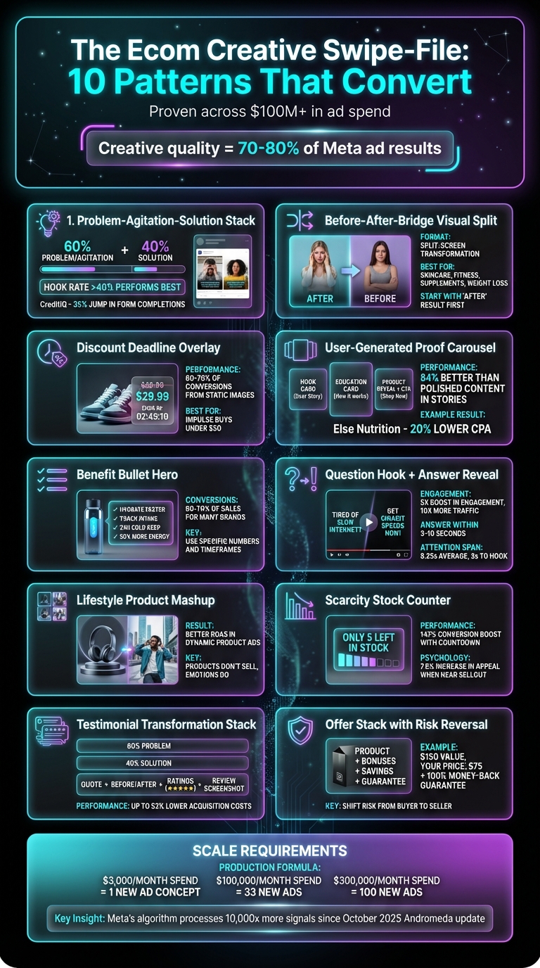
10 High-Converting Meta Ad Patterns for Ecommerce Success
10 Meta Ads Creative Formats That Convert Like Crazy in 2026
Put the playbook to work
Apply this playbook to your page
Paste your website and the Lab will turn the strategy you are reading into a ready-to-test ads.
Free to try No prompt writing
Why Ad Patterns Work Better Than Random Testing
Many advertisers approach creative testing like throwing darts blindfolded - tweaking a headline here, changing a button color there, and hoping for the best. But this trial-and-error strategy often falls short.
Great ads don't happen by chance. They follow proven psychological triggers. In just 1.7 seconds, your ad needs to grab attention, communicate a clear benefit, and inspire action. Random testing rarely achieves all three. Ad patterns, on the other hand, consistently deliver because they rely on structured frameworks like Problem-Agitation-Solution, Before-After-Bridge, and social proof stacks. These aren't just creative tricks - they're grounded in how people make decisions while scrolling through their feeds. And with Meta's algorithm prioritizing engaging and clear creative content, relying on these frameworks is more important than ever. A weak ad can drain your budget fast, so using patterns is a smarter, more efficient approach.
Patterns save time, reduce waste, and combat creative fatigue. For example, you know your hook needs to disrupt the viewer's scrolling or spark curiosity. The body copy should emphasize transformation over features. And social proof? It lowers perceived risk. By refining these proven elements, you can test faster, avoid ineffective ideas, and allocate your budget to ads that actually work. In contrast, random testing often leads to creative fatigue because you're just making minor tweaks to the same concept. Meta's algorithm penalizes this redundancy. If your "new" ad is just a headline change, the algorithm might treat it as the same creative, accelerating fatigue. Patterns solve this by giving you a structured way to create diverse ads. By testing different angles - problem-driven, benefit-focused, or social proof-heavy - you signal to the algorithm that these are unique creatives, which helps them perform better across different audience segments.
"The difference between media buyers who consistently produce winning creatives and those who rely on luck is a systematic approach to reverse engineering what already works." - Adligator Team
In short, ad patterns transform creative testing from guesswork into a reliable system. They let you brief faster, create more effective ads, and scale campaigns without wasting your budget on ideas that were never likely to succeed.
1. Problem-Agitation-Solution Stack
This structure is a cornerstone of direct-response advertising because it taps into how people make decisions - emotion first, logic second.
Here’s how it works: start by zeroing in on a specific pain point your audience faces. Not something vague - make it personal and relatable, like a frustration they’ve likely dealt with this week. Next, crank up the tension by showing what happens if they ignore the issue. Highlight the costs, the ripple effects on their life or business, and the stress it creates. Finally, introduce your product as the solution that brings relief.
The magic lies in the 60/40 split: dedicate 60% of your ad to the problem and agitation, and only 40% to the solution. Many advertisers get this backward, turning their ads into product brochures that fail to grab attention. The first three seconds are critical - ads with a hook rate above 40% (calculated as 3-second views divided by impressions) consistently perform better.
Take CreditIQ, for example. They used this framework to promote their loan comparison tool. First, they highlighted hidden fees as the Problem, then agitated by showing how failing to compare loans could cost thousands of dollars. Finally, they introduced their transparent platform as the Solution, leading to a 35% jump in form completion rates over three months. Similarly, Tranquil Minds boosted enrollment for their stress-management course by addressing daily pressures, emphasizing the long-term health risks of untreated stress, and positioning their 6-week program as the answer - resulting in a 50% enrollment increase in two months.
"The copy opens by naming a specific problem, amplifies the emotional weight of that problem, then introduces the product/service as the solution." - Adligator Team
Pace yourself - don’t rush to the solution. Skipping or speeding through the agitation phase can weaken the perceived value of your product. Let the tension simmer before showing how your solution resolves it. This is why smartphone-quality UGC (user-generated content) videos using this framework outperform polished studio content by 84% in Stories placements. They feel authentic, and the problem-first angle creates a sense of urgency.
2. Before-After-Bridge Visual Split
Once you've tapped into emotional storytelling, another highly effective framework relies on the power of visuals to showcase transformation instantly.
This approach works because it puts the transformation front and center. By presenting the "before" and "after" side by side, it removes any guesswork for the viewer. The formula is straightforward: Before highlights the current struggle or problem, After illustrates the ideal outcome, and Bridge positions your product as the solution that connects the two. On Meta ads, this often takes the form of a split-screen image or a quick video sequence where the change is revealed within seconds. The visual itself does the heavy lifting, making the transformation crystal clear. This approach fits seamlessly with Aden's Lab's process: drop a link, get ads, and launch on Meta without worrying about manual creative tweaks.
"Split screen before/after - Visual transformation, no words needed." - Curtis Howland, Founder, Misfit Marketing
Start with the "After" result. Leading with the final outcome creates a curiosity gap - viewers are drawn in because they want to know how that result was achieved. This tactic works especially well in industries like skincare, supplements, fitness, and weight loss, where compelling visual proof is a powerful selling tool. If your hook rate (3-second views divided by impressions) falls below 25%, it’s often a sign that your "After" visual isn’t strong enough to grab attention.
Stick to authentic, relatable visuals. Overly polished, studio-quality images often fall flat compared to raw, smartphone-style before/after shots. Genuine visuals foster trust and encourage deeper engagement. Just ensure your copy aligns with the visual: start by addressing the pain point, move to the solution, and close with a clear call to action that ties back to your product as the bridge. This straightforward visual storytelling not only grabs attention but also sets the stage for more advanced creative strategies to boost ad performance even further.
3. Discount Deadline Overlay
Once your offer is clear, the next step is to create urgency. A discount deadline overlay is a simple yet effective way to do this. It combines a clear discount with a time limit, displayed prominently on your ad creative.
Here’s how it works: show the original price crossed out, highlight the discounted price, and include a specific deadline (e.g., "Ends tonight at midnight"). This technique leverages price anchoring, where the viewer instantly sees the savings and perceives the value gap. For impulse buys under $50, this urgency-driven approach can significantly speed up decision-making. Using bold text and high-contrast colors ensures the overlay grabs attention and emphasizes the limited-time nature of the deal. Even top advertisers rely on this structure to drive higher conversion rates.
"The offer is often the difference between a winning ad and a loser. Test these structures, sometimes changing the offer beats changing the creative." - Curtis Howland
Static images with deadline overlays are gaining traction again because they act as compact promotional tools. Everything the viewer needs to know is right there in the feed. Many successful brands report that 60–70% of their conversions now come from static images rather than videos. Specific offers, like "Save $40 today only", create a stronger sense of urgency compared to vague messaging. Adding guarantees, such as free shipping or money-back assurances, can further reduce friction for potential buyers.
Interestingly, simpler designs often outperform polished ones. Lo-fi, “ugly” ads with straightforward text overlays tend to blend into the organic feed better, making them feel less like ads. Think black-and-white bold text, handwritten notes, or post-it style callouts. Overly polished designs can break the authentic feel of the feed and hurt performance. Another common mistake? A mismatch between the ad and the landing page. If your ad promises "30% off ends tonight", but your landing page doesn’t immediately reflect that same discount and deadline, expect higher bounce rates.
Speed is key when producing these overlays at scale. Quick creative turnaround allows you to test different urgency tactics - like time-limited versus stock-limited offers - every 7–10 days without delays from design teams. Services like Aden's Lab make this process seamless. Just drop a link, and they’ll generate ready-to-launch ads with the discount overlay formatted for Meta, eliminating the need for manual design work.
4. User-Generated Proof Carousel
Once you've created urgency, the next step is to show your product works. A user-generated proof carousel is a great way to do this. It showcases real customers using your product through a series of cards that tell a story. Here’s how it works: the first card grabs attention with a problem or question (don’t start with your product). The middle cards build interest by offering education or proof, and the final card reveals your product with a clear call-to-action (CTA). This sequence builds trust naturally before asking users to take action.
This approach works particularly well for products that require a bit of explanation - think supplements or skincare. Customers often need to understand the "why" before they're ready to buy. Interestingly, smartphone-captured content outperforms polished studio visuals by 84% in Stories. That means you don’t need to overdo it with professional production. Raw, unscripted content - like screenshots of customer messages or casual smartphone videos - blends effortlessly into feeds and feels more authentic than overly polished ads.
"Carousels work best for education-heavy products and comparison-based selling... Card 1 hooks with a problem or question (never your product). Build tension through the middle cards. Save the product reveal and CTA for the final card." - Curtis Howland
In 2025, Else Nutrition, a brand offering plant-based baby formula, leaned into authentic user-generated content (UGC) from creators worldwide. The result? A 20% lower Cost Per Acquisition compared to other creatives. Their UGC ads also doubled viewing time versus high-budget agency videos, with content production costs starting at just €23 per video. Similarly, Soli App used organic carousels that were already thriving on TikTok. This led to a 1.78x boost in Click-Through Rate (CTR) and a 1,000% jump in conversions. These examples highlight how real customer stories can be far more persuasive than traditional brand messaging.
Incorporating user-generated carousels into your strategy ensures you're making the most of every advertising dollar. The challenge? producing enough carousel variations to test different hooks and proof points by automating Meta ad production. Sourcing UGC at scale or waiting for designers to format everything can slow things down. That’s where Aden's Lab comes in. Their tool simplifies the process - just drop a link, get your ads, and launch them on Meta. This allows you to test multiple carousel variations quickly without the usual back-and-forth.
5. Benefit Bullet Hero
Once you've showcased your product's effectiveness through real customer stories, the next step is to deliver its value instantly. A Benefit Bullet Hero is a static ad format that pairs a clean product image with short, benefit-focused text overlays. The product takes center stage against a simple background, while the bullet points highlight exactly what the viewer gains from it. It's straightforward, attention-grabbing, and effective.
This approach works particularly well for impulse purchases priced under $50. Why? Because impulse buys thrive on clear, specific benefits. Instead of vague promises like "improve your results", go for something concrete, like "reduce CPA by 34% in 14 days". Numbers and timeframes make your message more compelling, giving viewers a solid reason to pause and engage. Plus, Meta's algorithm favors this type of clarity in messaging.
"Your creative is now doing the targeting work. If you're still building interest-based audiences... you're over-constraining the algorithm." - Curtis Howland
Static ads like the Benefit Bullet Hero are responsible for 60–70% of conversions for many e-commerce brands. Why? They're quicker to produce and easier to tweak compared to video ads. A common mistake advertisers make is over-polishing visuals or relying on generic claims. Instead, raw and authentic imagery paired with bold, high-contrast text (like black-on-white) often performs better. These ads blend seamlessly into social feeds, feeling less like ads and more like organic content, which helps them stand out.
This format is all about simplicity and authenticity. It communicates benefits quickly and effectively. However, the challenge lies in testing enough variations to determine which benefit resonates best with your audience. For instance, using one product image but experimenting with different bullet points - focusing on speed, price, or social proof - can be time-consuming to produce manually.
That's where Aden's Lab steps in. Their tool eliminates the creative bottleneck by generating multiple static Benefit Bullet Hero ads from just one product link. Simply drop the link, and you'll receive ready-to-launch ads for Meta - no need for design briefs or endless revisions.
6. Question Hook + Answer Reveal
Starting your ad with a question is a powerful way to grab attention. A question naturally prompts the viewer's brain to engage, creating a "curiosity gap" - that irresistible urge to find the answer.
Here’s why this approach matters: the average American attention span while scrolling is just 8.25 seconds. You’ve got about 3 seconds to make an impression. A well-executed question hook can boost engagement by 5× and drive 10× more traffic to your ad. Why? Platforms like Meta reward engaging content with lower CPMs and better cost-per-result metrics, as it keeps users interacting.
The formula is straightforward: ask a question that speaks directly to a pain point or desire, then reveal the answer with your product. For example: "Why is your moisturizer aging you?" Follow it up quickly with the solution. The key is to deliver the answer within 3–10 seconds to maintain trust and attention.
"Questions work because they engage the reader as an active participant rather than a passive observer. They can't help but try to answer, even if just in their head."
- Victor G. Clatici, Senior Dermatologist and Business Consultant
However, it’s easy to misstep with vague or overly abstract questions. For instance, "What if you could change everything?" might sound intriguing but lacks focus. Compare that to a more targeted question like, "What if you were debt-free in 90 days?" - it’s specific, emotionally charged, and immediately relatable. Always ensure the answer follows within 3–10 seconds to keep the viewer engaged.
For carousel ads, use the first card to pose the question, build anticipation with the middle cards, and save the product reveal for the final card. This structure keeps viewers invested throughout.
If brainstorming effective question-and-answer combinations feels overwhelming, tools like Aden's Lab can help. Simply provide your product link, and it will generate multiple Question Hook + Answer Reveal ads, ready to launch on Meta. Once you find a winner, you can scale your successful ad creatives to maintain performance.
7. Lifestyle Product Mashup
The lifestyle product mashup blends simplicity with emotion by combining a plain product image and a lifestyle shot in one frame. The product image explains what the item is, while the lifestyle shot conveys how it feels to own or use it. This pairing strikes a balance between clarity and emotional resonance.
Why does this approach work? As Bhuvi Gupta from Socioh explains, "Products don't sell, emotions do." A plain product image provides the essential details, while the lifestyle shot connects with the viewer on an emotional level. Together, they create a compelling visual narrative.
This strategy also has practical benefits for Meta ads. Nearly all advertisers who swap plain product images for lifestyle mashups in Dynamic Product Ads see better ROAS (Return on Ad Spend). Additionally, Meta's Andromeda system tends to group similar ads under a single "Entity ID" when too many identical creatives are uploaded, which can limit visibility. Lifestyle mashups add variety, helping your ads stand out and reach more users.
The best part? You don’t need a production team to make it happen. Simply combine a secondary lifestyle image (often featured on your product page) with your main product shot in a two-image grid. Brands like Burga (known for phone covers) and Rylee + Cru (children's clothing) use this technique to create visually engaging ads without expensive photoshoots. If your product catalog follows a pattern - such as listing a product image first and a lifestyle image second - you can even automate the process by mapping the image indices in your feed.
For those managing a large number of SKUs, tools like Aden's Lab produce Meta ads on autopilot to simplify the process. By dropping in your product link, you can generate ready-to-launch lifestyle-product mashup ads - no templates or design skills required.
8. Scarcity Stock Counter
A scarcity stock counter displays the exact number of remaining units, like "Only 5 left" or "14 remaining at this price." These precise figures create a sense of urgency that vague phrases like "Limited stock" just can't achieve. When people see an exact count, they feel the need to act fast - it taps into the instinct to value things that are rare.
This approach plays on loss aversion, where the fear of missing out (FOMO) outweighs the desire to gain. A low stock number also acts as subtle social proof, showing that others are actively buying the product. Research backs this up: showing that an item is close to selling out can increase its appeal by 7.6%. Pair that with a 30% discount, and buyers become 178% more likely to make a purchase. For example, Marcus Taylor, founder of Venture Harbour, saw a 147% boost in conversions by adding a limited-offer sign and countdown timer to the call-to-action on MusicLawContracts.com. Similarly, Booking.com achieved an 18% increase in bookings after implementing real stock indicators.
The trick is to be specific and honest. A message like "Only 14 left" grabs attention far better than a generic "Limited stock" claim. But be careful - falsely inflating scarcity can backfire, damaging trust if the product page doesn't reflect the low stock levels you advertised.
Once you've created urgency with clear numbers, think about how you present this information. Authenticity matters. Instead of using overly polished graphics that scream "advertisement", go for simple, native-style elements. If you need more inspiration, you can brainstorm unique campaign concepts tailored to your specific product. For example, plain text overlays in high-contrast colors (red is often used to signal urgency) blend naturally into social media feeds. And if you're juggling hundreds of products, updating creatives manually can be exhausting. Tools like Aden's Lab let you automate scarcity-driven static ads - just drop in your product link, and you're ready to launch on Meta.
9. Testimonial Transformation Stack
A Testimonial Transformation Stack goes beyond a simple "I love this product" statement. It tells a story, layering the customer's journey from their initial struggle to their ultimate transformation. Here's the trick: focus about 60% of your creative on the problem and 40% on the solution. Why? Because starting with the problem grabs attention - it reflects the viewer’s own experience rather than pushing a product on them.
The "stack" concept means combining multiple proof elements into one creative. For example, pair a customer quote with a before-and-after visual, add star ratings, and include a screenshot of a real review or direct message. This layered approach builds trust by hitting credibility from multiple angles. And always use the customer’s actual words - phrases pulled directly from forums or reviews. When people see their own language echoed back, the ad feels authentic, like a real conversation rather than a sales pitch. Bonus: testimonials displayed under a creator’s handle can reduce acquisition costs by up to 53%. When testing these creatives, aim for a hook rate above 40% (calculated as 3-second views divided by impressions) to gauge scalability.
Here’s a key tip: don’t start with your logo or product name. Instead, lead with the struggle. A headline like "I couldn't sleep for three years" is far more compelling than "Try our sleep supplement." Avoid vague claims such as "this changed my life." Instead, get specific: "lost 23 lbs in 30 days" or "reduced redness in 4 days" adds real weight to your message. And never skip the "before" state - the transformation only resonates if viewers understand where the customer began.
If you're producing these stacks at scale, efficiency is critical. Tools like Aden's Lab simplify the process. Just drop a link, and you’ll get ready-to-launch creatives designed for Meta - no setup or prompts needed. These ads are built to deliver proof exactly how real buyers want to see it.
10. Offer Stack with Risk Reversal
An Offer Stack is like creating a mini landing page within your ad. It layers your main product with bonuses, detailed savings, and guarantees, emphasizing the overall value. But the real game-changer? Adding risk reversal.
Risk reversal shifts the uncertainty from the buyer to you, making it easier for potential customers to say "yes." Think about it - offering a money-back guarantee, free trial, or "cancel anytime" policy can ease the fear that often stops someone from completing a purchase. And while these options are available, most buyers won’t go through the hassle of using them if they’re confident in your product.
Here’s how to make it work: Pair your product with clear bonus details and guarantees. Spell out the savings in a way that’s easy to digest. For instance, present your bundle like this: "$150 value, your price: $75," and break down each item in the package. Adding a badge like "100% Satisfaction Guaranteed" or "Risk-Free for 30 Days" can also reassure buyers. Specific promises work best - something like "Double your money back if you don't see results in 30 days" is far more convincing than a vague satisfaction guarantee. To find which specific promise resonates most with your audience, consider A/B testing different offer variations to see what drives the highest conversion rate.
"Risk reversal simply means taking the purchase risk away from the customer, and taking it on yourself or your business." – Bernard Keavy, Business Consultant
Timing is everything. Tools like Aden's Lab make it simple to create Meta ads that align with your offer. Just drop in your URL, and their platform generates ready-to-launch creatives designed to perform well with Meta’s algorithm - no setup, no prompts, no delays. It’s a fast way to scale your campaigns without the usual creative roadblocks.
How to Produce Enough Creatives to Actually Scale
Knowing what works is one thing, but producing enough creative content to scale effectively? That’s a whole different challenge. The numbers tell the story: for every $3,000 spent monthly on Meta, you need at least one new ad concept. Spending $100,000 a month? That’s around 33 new ads. At $300,000, you're looking at roughly 100 ads - just to keep up with creative fatigue. For most teams, producing at this scale is nearly impossible without either expanding the team or shelling out for agency retainers that can outpace your media spend. This bottleneck is what often derails campaign momentum. This often happens when brands fail to scale Meta ads with AI budget allocation to support increased creative output.
Here’s the typical scenario: you find a winning ad angle, scale it for a few weeks, and then performance starts to dip as the creative loses its edge. You scramble to brief a designer, wait for revisions, and by the time the new ad is live, the initial momentum is long gone. The real issue? Production speed.
ADEN'S LAB addresses this exact problem by cutting out the manual vs automated ad creation dilemma entirely. All you need to do is drop your product link, and the platform generates high-performing static Meta ads in minutes. No prompts, no lengthy design briefs, no endless back-and-forth. It’s designed to follow proven patterns (like the ten outlined earlier) and delivers ads that are ready to launch. At just $0.90 per ad on the highest-volume plan, you can create hundreds of ads each month for less than the cost of a single concept from most agencies.
Scaling isn’t just about having the right creative strategy - it’s about keeping your campaigns fresh with fast ad production. The ability to test, iterate, and replace fatigued ads before they impact your return on ad spend keeps you ahead of the game. And in 2026, the brands that win won’t just excel in media buying - they’ll dominate in production speed.
Conclusion
Applying these 10 proven patterns can significantly improve your ad performance. In fact, creative quality now accounts for 70–80% of Meta ad results, far surpassing factors like budget or targeting settings. These patterns aren't just theoretical - they're tested and validated at scale. Instead of relying on guesswork or waiting for a spark of inspiration, you can start with a solid, proven framework every time.
The real challenge lies in producing these ads quickly enough to stay ahead of creative fatigue and efficiently scale campaigns. This is where having a streamlined creative process becomes invaluable.
ADEN'S LAB addresses this challenge by generating high-performing static Meta ads from just a single product link. Simply drop in a link, and you’ll receive ads built around these patterns, ready to launch on Meta in minutes. And at just $0.90 per ad on their highest-volume plan, you can create hundreds of ads each month for less than the cost of a single designer-made concept.
With these patterns in hand, start implementing them, test thoroughly, and let the data guide your refinements. The brands that dominate in 2026 will be those that master efficient creative production and keep their ads fresh and engaging.
FAQs
Which 1–2 patterns should I test first?
Start with two effective strategies: scroll-stopping hooks and short-form vertical videos or UGC (User-Generated Content). Scroll-stopping hooks grab attention instantly, which is crucial for improving engagement metrics like clicks and watch time. Meanwhile, short-form vertical videos and UGC are currently trending and deliver strong results. These formats align perfectly with Meta’s emphasis on creative performance, helping you see quicker outcomes and scale more efficiently.
How do I know when an ad is fatigued?
You can identify ad fatigue by keeping an eye on performance metrics such as click-through rate (CTR), conversions, and engagement trends over time. If these numbers consistently drop, it’s a clear sign the audience has grown tired of seeing the same ad, and it’s losing its impact. Another critical factor to monitor is ad frequency - when this number climbs too high, performance often stalls or declines, indicating it’s time to update your creative approach.
How many new ads do I need each month?
To determine how many new ads you need each month, consider your goals and the size of your campaigns. A common recommendation is to test 10–20 new ads every month. This approach keeps your content fresh and helps prevent ad fatigue. It also allows you to experiment with different hooks, visuals, and offers without overstretching your budget. By consistently updating your creatives, you can quickly identify what resonates with your audience and scale successful ads more efficiently.
Your next ad batch starts here
Finish with a ready-to-test ad batch
Paste your website to generate static creatives. Drop the link → get ads in about 90 seconds → upload them to Meta → scale.
Free to try No prompt writing