Meta Ad Prompts for Baby and Parenting Products
Use the prompts on your real offer
Generate these ad angles for your product
Skip the blank prompt box. Paste your product page and ADEN'S LAB applies the angles to your offer, images, headlines, and copy.
Free to try No signup No prompt writing

Baby and parenting brands usually miss on Meta for one simple reason: the ad tries to sell too many things at once. For static ads, the fix is a tighter prompt built around one buyer tension, one promise, and one format. This page gives a ready-to-test way to do that for diapers, feeding gear, sleep products, strollers, maternity items, and stage-based offers. It keeps the work inside the current ADEN'S LAB flow: paste a supported product URL, let the tool pull available visuals and messaging, generate multiple static ads, review the outputs, download the best options, and test them with one variable changed at a time.
Static Meta ads for baby and parenting products work best when the prompt is narrow enough to control the message.
That means six inputs:
- product
- parenting stage
- main outcome
- tone
- ad format limits
- placement
If any one of those is vague, the output usually gets soft fast.
A weak prompt says: write a Facebook ad for a baby product.
A usable prompt says: write static Meta ad copy for an overnight diaper for New Parents (0–12 months), focused on dry sheets by morning, with a calm tone, primary text under 125 characters, headline under 40, for Instagram Feed.
That difference matters because static ad testing on Meta is usually won or lost in the first line and the first visual read.
The main rule: pick one buying tension per ad.
Not safety and convenience and bonding all in one frame.
Just one.
For baby and parenting products, the six angles in the source piece reduce to a simple working model:
- Safety & Trust for proof-led products
- Convenience & Routine for repeat-use products
- Sleep Support for night problems
- Bonding & Emotion for feeling-led buys
- Development & Stage Fit for age-based offers
- Stress Relief for high-friction moments
The useful part is not the labels. The useful part is matching each product to the pain that gets the click.
A baby monitor can be sold as safety, reassurance, or sleep support.
If the product page leans on late-night checking, the first static test should not wander into material quality or family storytelling. It should stay on that one moment: waking up at 3:00 AM to check again.
That same discipline applies across the category.
A spill-proof cup is not about lid design in the ad. It is about no juice stains on the couch.
A bottle warmer is not about heat time in the ad. It is about getting back to bed faster.
A stroller is not about folding mechanics in the ad. It is about one hand free in the parking lot.
That is the useful takeaway from the article: features matter only after they are translated into a plain daily outcome.
Here is the one table worth keeping in front of the team before prompt writing starts:
| Product type | Best first angle | What the static ad should sell |
|---|---|---|
| Diapers, skincare, skin-contact items | Safety & Trust | Material proof, dryness, peace of mind |
| Strollers, diaper bags, gear | Convenience & Routine | Less hassle, easier daily use |
| Swaddles, sound machines, sleep items | Sleep Support | A calmer night or steadier nap |
| Baby carriers, keepsakes, maternity items | Bonding & Emotion | One clear emotional scene |
| Subscription boxes, toys, preschool products | Development & Stage Fit | A milestone tied to age |
| Feeding gear, monitors, problem-solution products | Stress Relief | One pain point removed |
Once the angle is set, the copy should stay short enough for mobile and plain enough to scan in under a second.
The source article points to common Meta limits worth using in the prompt:
- Primary text: under 125 characters
- Headline: under 40 characters
- Description: under 30 characters
Those are not style points. They force sharper copy.
For static baby ads, the best prompts usually follow this pattern:
Write static Meta ad copy for [product] for [parenting stage].
Lead with [specific pain point or moment].
Focus on [single outcome], not features.
Tone: [calm / direct / warm / low-pressure].
CTA: [Shop Now / Learn More / See How It Works].
Primary text under 125 characters. Headline under 40. Description under 30.
Placement: [Feed / Stories / Reels cover text / Carousel card].
That structure is simple, but it keeps the ad from drifting.
A few prompt moves from the article are worth keeping because they map cleanly to static testing.
Use proof first when the buyer needs a reason to trust the claim.
That fits organic cotton, non-toxic claims, certifications, guarantees, and testimonial-led outcomes.
Examples:
- “100% organic cotton”
- “No leaks through the night”
- “30-day money-back guarantee”
These work because they give the ad one hard point to carry.
Use routine friction when the product earns its place through repeat use.
That fits diaper subscriptions, machine-washable bibs, one-hand fold strollers, and bottle warmers.
The ad should open on the annoyance, not the item.
Examples:
- running out of diapers at night
- scrubbing the high chair again
- trying to fold the stroller with groceries in hand
Use sleep moments, not sleep categories.
“Better sleep” is too broad for a static test.
A swaddle ad should be about the baby finally settling.
A sound machine ad should be about the house staying quiet.
A blackout shade ad should be about the nap holding.
That kind of narrow framing gives the visual and the line of copy the same job.
Use one emotional scene, not broad sentiment.
The article is right to reject soft lines like cherish every moment.
For a baby carrier, the stronger entry is the baby settling against the parent’s chest.
For a keepsake product, the stronger entry is the parent picturing themselves six months from now, glad they saved this season.
That gives the static ad a scene instead of a slogan.
Use stage language only when it sharpens recognition.
“Parents” is too broad.
“New Parents (0–12 months)” and “Parents with Toddlers (1–2 years)” are much tighter.
Stage fit matters because the emotional trigger changes:
- newborn: protection, sleep, first-month reassurance
- toddler: mess, routine, picky eating, movement
- preschool: confidence, readiness, learning
A newborn bundle should not sound like a preschool toy ad, even if both live under the same brand.
The article’s best operational point is the testing method: change one variable at a time.
For static Meta ads, that usually means keeping the product, angle, and offer fixed while changing only one of these:
- hook
- headline
- visual treatment
- CTA
- stage framing
Not all five at once.
That matters in ADEN'S LAB because the clean workflow is already built around source-page inputs, not blank-page guessing.
The path is simple:
- Paste a supported product URL
- Let the product extract available visuals and messaging from the page
- Generate multiple static creatives around one angle
- Review the outputs for message discipline
- Download the best options
- Test selected ads against one controlled variation
Used that way, the tool is not there to make the brief broader. It is there to make versioning faster after the angle is already clear.
That point is easy to miss.
If the input prompt mixes safety, savings, bonding, and development into one ask, the generated static ads will usually look muddy for the same reason the brief was muddy.
The cleanest use of the workflow is to keep each batch narrow.
For example:
- one batch for overnight dryness
- one batch for non-toxic materials
- one batch for less cleanup dread
Not one batch trying to cover all three.
A simple checklist from the article helps before any prompt goes into production:
- Does the ad name one parent pain point?
- Does it promise one plain outcome?
- Does the opening line sound like a real moment?
- Is the copy short enough for mobile?
- Is the angle tied to the product page?
- Can the test isolate one changed variable?
If the answer is no on any of those, the prompt likely needs tightening before the ad does.
One more point from the article is worth keeping: not every product should open on the product page’s feature list.
That sounds obvious, but it is where many baby ads go wrong.
The page may list:
- machine-washable
- BPA-free
- ergonomic
- leak-resistant
- easy-fold
The ad still needs to choose one buyer-facing meaning from that list.
For static ads, that translation layer is the whole job.
Examples:
- machine-washable → less time scrubbing
- BPA-free → more peace of mind at mealtime
- easy-fold → easier parking-lot cleanup
- leak-resistant → dry sheets by morning
That is what makes a prompt ready to test instead of just descriptive.
The article also makes a fair point about first format selection.
Some angles fit static better than others, but for the current ADEN'S LAB workflow the focus stays on static generation. That means the prompt should help the image do part of
How to Structure Every Meta Ad Prompt
Every strong Meta ad prompt for a parenting product follows proven Meta ad copy frameworks and has six parts: product type, parenting stage, core benefit, emotional angle, output format, and placement. Once you have that setup, you can swap the placement or output format and make a new version without rewriting the whole thing.
Start with a specific product type and parenting stage. For example, use "organic cotton swaddle" for "New Parents (0–12 months)." That helps the output match the right part of family life instead of sounding vague.
The core benefit is the end result. It shows what life looks like after the product fixes the problem. The emotional angle shapes the tone: empathetic, reassuring, humorous, or stress-relief focused. It helps to tie that tone to a real moment, like "8 PM exhaustion after the kids are in bed" or "Monday morning chaos." That’s what makes the copy feel human instead of flat.
The last two parts shape the final ad. Output format means telling the AI the exact Meta character limits: primary text under 125 characters, headline under 40, and description under 30. Placement tells the AI where the ad will appear. Reels and Stories need short lines and fast breaks, while Feed and Carousel ads can hold a bit more structure.
| Building Block | What to Specify | Key Constraint |
|---|---|---|
| Product Type | Exact item (e.g., "convertible car seat") | Be specific, not generic |
| Parenting Stage | Meta demographic label (e.g., "Parents with Toddlers") | Match to 0–12 months, 1–2 years, 3–5 years, etc. |
| Core Benefit | The outcome (e.g., "2 extra hours of sleep") | Focus on solving a pain point |
| Emotional Angle | Tone + context (e.g., "reassuring, 8 PM context") | Joy, security, stress relief, humor |
| Output Format | Character counts per ad element | Primary: <125, Headline: <40, Description: <30 |
| Placement | Ad format (e.g., "vertical video for Reels") | Feed, Stories, Reels, Carousel |
Here’s how that looks with a baby monitor. Product type: "HD baby monitor with night vision." Parenting stage: "New Parents (0–12 months)." Core benefit: "Check on baby without entering the room." Emotional angle: "Reassuring, late-night context." Output format: primary text under 125 characters, headline under 40. Placement: Instagram Feed.
That mix is specific enough to produce test-ready copy right away.
The big plus here is easier testing. Keep the product and benefit the same, then change only the emotional angle, like switching from "humorous" to "reassuring." That makes it much easier to spot what gets parents to click. One variable at a time. That’s the cleanest way to read the results.
With the structure in place, the next step is picking the angle that fits the product and pain point best.
sbb-itb-628c49f
Put the playbook to work
Apply this playbook to your page
Paste your website and the Lab will turn the strategy you are reading into a ready-to-test ads.
Free to try No signup No prompt writing
How to Choose the Right Prompt Angle for Your Product
Once the product type, stage, and core benefit are clear, the next job is simple: pick the angle that matches the parent's main worry or friction point. Keep each ad centered on one main value and no more than two supporting points. That keeps the message sharp and gives the creative a fair test.
The quickest way to get this right is to match the product to the buying tension behind it. A parent rarely buys because of a feature alone. They buy because they want fewer messes, less stress, more peace of mind, or a smoother part of the day.
Use these angle rules:
- Safety & Trust: Best for products that touch skin or need reassurance before purchase. Lead with organic materials, chemical-free claims, absorbency, or other safety signals.
- Convenience & Routine: Best for diaper bags, feeding accessories, and products tied to repeat daily use. Lead with time saved or mess avoided, not the feature by itself.
- Sleep Support: Best for nighttime products and anything linked to rest. Show the calm morning outcome, not just the sleep feature.
- Bonding & Emotion: Best for maternity gear and newborn care items where the purchase is emotional as well as practical.
- Development & Stage Fit: Best for age-based products such as subscription boxes and educational toys. Call out a clear milestone, not just a broad age range.
- Stress Relief: Best when the buyer feels overloaded or is dealing with a defined pain point like picky eaters or mealtime panic.
Here’s the fastest way to map product type to angle.
| Product Category | Lead Angle | What to Emphasize |
|---|---|---|
| Diapers, skin-contact items | Safety & Trust | Organic materials, chemical-free, absorbency |
| Strollers, diaper bags | Convenience | Easy fold, durability, cleanup |
| Feeding gear | Stress Relief | Picky eaters, mealtime panic, time saved |
| Sleep products, mattresses, bedding | Sleep Support | Full night's rest, calm morning outcome |
| Educational toys, subscription boxes | Development | Age-specific milestones, learning through play |
| Maternity, newborn wear | Bonding & Emotion | Emotional storytelling, lifestyle imagery |
If a product can sit in two angles, go with the parent's current priority. For new parents, that usually means Safety & Trust first.
This matters inside ADEN'S LAB because the angle should shape the input before creative generation starts. Paste a supported product URL, let the tool pull the available visuals and messaging, then generate multiple static ads based on one clear angle at a time. Review the outputs, download the ones that stay tight to that angle, and test them against a second angle only if the first message is too broad or too weak.
A simple example:
A baby spoon set could be framed as convenience, but if the page leans hard into fussy eating and stressful meals, Stress Relief is the better lead.
A crib mattress may mention materials and breathability, but if the buyer is shopping for better nights, Sleep Support is the stronger first angle.
The goal is not to squeeze every product into the same message. It’s to pick the angle that gives the ad a clean job. That makes prompt writing easier, static creative more focused, and testing less noisy in Meta.
Prompt Angle Comparison Table
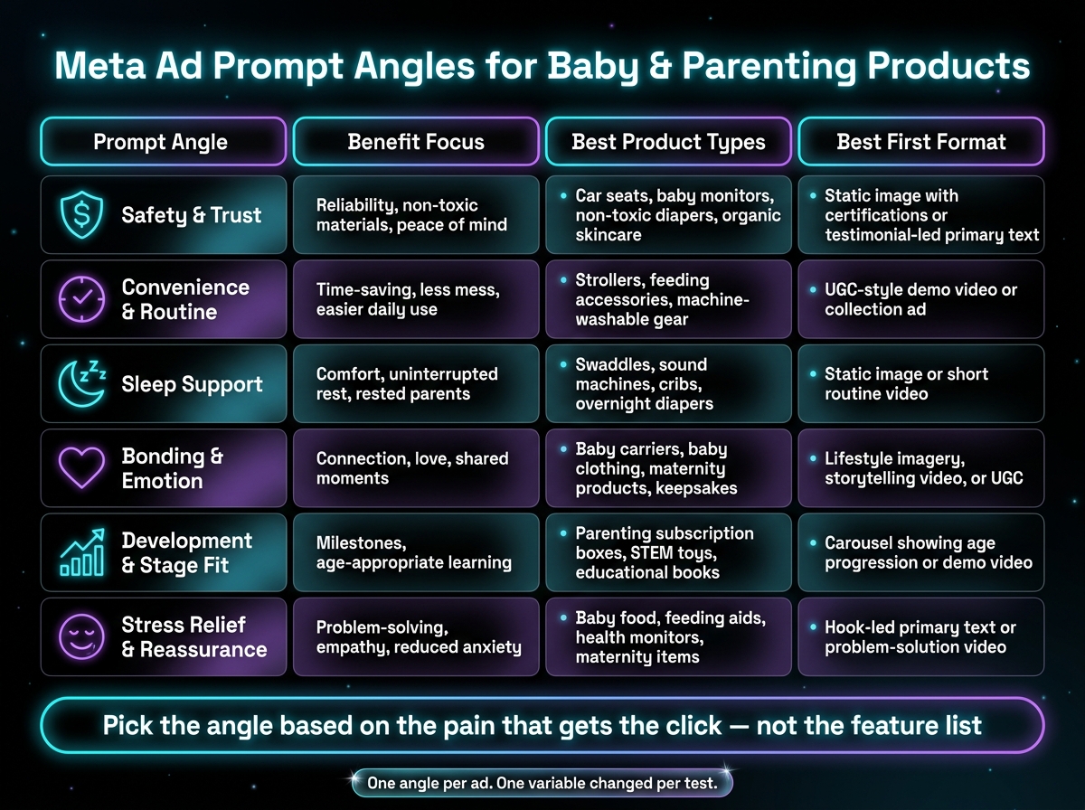
Meta Ad Prompt Angles for Baby & Parenting Products: Quick Reference Guide
Use this table to pick the angle and first ad format before writing the prompt. If a product could sit in more than one lane, use this as the first filter for what to test first.
| Prompt Angle | Benefit Focus | Best Product Types | Best First Format |
|---|---|---|---|
| Safety & Trust | Reliability, non-toxic materials, peace of mind | Car seats, baby monitors, non-toxic diapers, organic skincare | Static image with certifications or testimonial-led primary text |
| Convenience & Routine | Time-saving, less mess, easier daily use | Strollers, feeding accessories, machine-washable gear | UGC-style demo video or collection ad |
| Sleep Support | Comfort, uninterrupted rest, rested parents | Swaddles, sound machines, cribs, overnight diapers | Static image or short routine video |
| Bonding & Emotion | Connection, love, shared moments | Baby carriers, baby clothing, maternity products, keepsakes | Lifestyle imagery, storytelling video, or UGC |
| Development & Stage Fit | Milestones, age-appropriate learning | Parenting subscription boxes, STEM toys, educational books | Carousel showing age progression or demo video |
| Stress Relief & Reassurance | Problem-solving, empathy, reduced anxiety | Baby food, feeding aids, health monitors, maternity items | Hook-led primary text or problem-solution video |
The point of this table is simple: don’t start prompt writing from a blank page. Start from the buying pain. That usually tells you both the message and the format.
A few patterns stand out.
- If the offer depends on proof, start with Safety & Trust.
- If the sale depends on showing how it fits into daily life, start with Convenience & Routine.
- If the product is bought to fix a night problem, Sleep Support is often the cleanest first test.
- If the purchase is more emotional than practical, Bonding & Emotion gives you better raw material for the ad.
- If parents need to see how the product changes with age, go with Development & Stage Fit.
- If the buyer is stressed and wants relief, Stress Relief & Reassurance usually gives the sharpest hook.
When a product fits two angles, lead with the one tied to the current buying pain. That matters more than the broad brand story. A diaper, for example, could fit Safety & Trust, Convenience & Routine, or Sleep Support. If the main promise is nighttime dryness, start with Sleep Support. If the pitch is cleaner materials, start with Safety & Trust.
This is also the cleanest way to use ADEN'S LAB without overcomplicating the brief. Paste the product URL, let the tool pull the available visuals and messaging, then generate multiple static creative routes based on the angle you chose first. Review the outputs, download the ads that match the angle, and test those before moving into a second message lane.
That step matters because weak tests often come from mixing too many ideas into one prompt. One ad tries to sell safety, convenience, and emotional connection all at once. The result is muddy. A tighter prompt usually gives a tighter static ad.
A simple working rule:
Pick the angle based on the pain that gets the click, not the feature list on the product page.
If the first angle doesn’t hold, then move laterally. Don’t rewrite the whole offer. Just shift the lens. A baby monitor can open on trust and reliability first. If that stalls, the next route might be reassurance for anxious parents. Same product, different buying trigger.
1. Safety & Trust
Use Safety & Trust when proof does more work than emotion. This angle fits products where a parent wants a clear reason to believe the claim before clicking. Think materials, test-backed claims, guarantees, or one sharp outcome that feels grounded in daily use.
These prompts work well for static Meta ads, UGC-style hooks, and short primary text. The goal is simple: give the reader one concrete point they can trust, fast.
- The Certification Hook
Prompt: "Write a Meta ad headline and primary text for [product name], a [diaper/skincare/feeding accessory] made with 100% organic cotton. Lead with the material fact. Tone: calm, trustworthy. CTA: Shop Now. Audience: parents who care about safety and material transparency. Primary text under 125 characters, headline under 40, description under 30."
Leading with a plain material fact gives the ad a firm starting point. For products in baby care, that matters. “100% organic cotton” is not fluff. It gives the parent something specific to weigh in a split second.
This is also a good fit for ADEN'S LAB. Paste in a supported product URL, let the tool pull the available product copy and visuals, then generate multiple static angles built around the material claim. From there, review the outputs, download the best variants, and test the ones that keep the proof front and center.
- The Micro-Story Testimonial
Prompt: "Write a Meta ad primary text using a parent testimonial for [product name]. The testimonial should include one specific, measurable result, such as 'no leaks through the night.' Keep it under 5 lines. Tone: warm, parent-to-parent. CTA: Shop Now. Primary text under 125 characters, headline under 40, description under 30."
Generic praise tends to blur together. A small story with one clear result lands harder. “No leaks through the night” works because it names the job and the outcome. It sounds like something a parent would actually tell another parent.
For static creative, this angle often works best when the visual and line of copy point to the same proof. If the page already includes reviews or short customer language, ADEN'S LAB can use that input from the URL to spin out several static concepts around one testimonial-style claim. That gives a team more than one direction to test without drifting into vague copy.
- The Risk Reversal Offer
Prompt: "Write a Meta ad for [product name], a [stroller/baby monitor/car seat], that leads with a money-back guarantee. Tone: confident, low-pressure. CTA: Try It Risk-Free. Primary text under 125 characters, headline under 40, description under 30."
A money-back guarantee can lower friction fast, but only if it appears early. If the parent has any hesitation on price, fit, or reliability, the first line can do a lot of heavy lifting by removing some of that pressure.
This angle is useful when the product page already makes the offer clear. In that case, the workflow is straightforward: paste the product URL into ADEN'S LAB, generate several static ad options that lead with the guarantee, review the layouts and wording, then test the versions that keep the offer clean and easy to scan.
- The Problem-First Safety Hook
Prompt: "Write a Meta ad hook and primary text for [product name], a [baby monitor/overnight diaper/feeding accessory]. Open with a late-night worry about whether the monitor will alert, then introduce the product as the fix. Tone: empathetic, direct. CTA: Learn More. Primary text under 125 characters, headline under 40, description under 30."
This approach starts with the moment, not the item. That’s usually the right move when the concern is immediate and familiar, like a parent checking the monitor at 2:00 a.m. The problem earns attention. The product then gets introduced as the answer.
Used well, this angle doesn’t drift into drama. It stays close to a real use case, then moves quickly to the fix. That makes it a strong option for short-form static testing, especially when paired with product-page visuals that already signal the category and use case.
Here’s a quick way to choose the right Safety & Trust angle:
| Angle | Best used when | What makes it work |
|---|---|---|
| Certification Hook | Material or ingredient proof is a buying factor | Starts with a concrete fact |
| Micro-Story Testimonial | Reviews include one clear outcome | Feels personal without sounding vague |
| Risk Reversal Offer | The offer removes hesitation | Cuts anxiety early |
| Problem-First Safety Hook | The product solves a known parent worry | Pulls the reader in through the moment |
The common thread across all four is simple: don’t ask the ad to do trust work with soft claims. Give it a fact, a result, a clear offer, or a familiar problem. Then let the creative carry that one point without clutter.
If the goal is to build static Meta ads from product-page proof instead of blank-page guesswork using AI platforms for Meta ads, this is exactly where ADEN'S LAB fits: paste a supported URL, let it extract the available visuals and messaging, generate multiple static creatives, review and download the strongest options, and test the selected ads against other angles in the account.
2. Convenience & Routine
Convenience ads work when they call out the exact point of friction, not just a broad product category. Spencer Lanoue, Founder, Postbase, puts it plainly:
"Instead of just listing product features, explain what they mean for the parent. Feature: 'Spill-proof sippy cup lid.' Benefit: 'Means no more juice stains on the couch and less time cleaning up messes.'"
That’s the core move here. Lead with the routine payoff. Don’t open on specs. Open on what gets easier: less cleanup, less hassle, less time wasted, fewer small fires to put out during the day.
This angle fits best when the buyer wants one thing above all: a smoother routine. That could mean saving time, cutting mess, or removing a repeat annoyance that keeps showing up at the worst time.
Single-focus ads tend to work better here because they stay tight. One friction point. One payoff. No wandering. That’s also why convenience ads beat feature-heavy ads by 52% in conversion rate.
A simple rule helps: show the moment, then show the fix.
| Hook | Friction moment | Payoff | Prompt use |
|---|---|---|---|
| Never Run Out | Out of diapers at night | Auto-delivery prevents the scramble | Subscription brands |
| Back to Bed Faster | Night feeding delay | Faster warm-up, less time awake | Bottle warmers |
| One-Hand Fold | Baby + groceries in parking lot | Easier stroller handling | Strollers |
| Mess-Free Routine | Cleanup after feeding | Less scrubbing, more time back | Feeding accessories |
The "Never Run Out" Subscription Hook
Use a scene every parent can picture right away: the middle-of-the-night diaper shortage. No long setup needed. The pain point does the heavy lifting because it’s specific and easy to feel.
Prompt: "Write a Meta ad for [diaper subscription brand] that leads with the middle-of-the-night diaper run pain point - running out of diapers at the worst possible time. Highlight automated delivery as the fix. Tone: practical, low-drama. CTA: Subscribe & Save. Primary text under 125 characters, headline under 40, description under 30."
The key here is restraint. Don’t explain the full subscription model. Just connect the problem to the outcome: diapers show up before the panic starts.
This fits cleanly into the current ADEN'S LAB workflow. Paste the product or collection URL, let the tool pull the available visuals and copy, then generate a batch of static ads built around this one use case. Review the outputs, keep the lines that stay concrete, download, and test the best few against a broader product-led control.
The "Back to Bed Faster" Night Feeding Hook
Night feeding is a repeat event, which makes it strong ad material. It’s not vague. It’s not theoretical. It happens over and over, and buyers know exactly what “back to bed faster” means.
Prompt: "Write a Meta ad for [bottle warmer brand] that focuses on a 2-minute warm-up time during a night feeding. Lead with the benefit of getting back to bed faster, not the feature. Tone: calm, empathetic. CTA: Shop Now. Primary text under 125 characters, headline under 40, description under 30."
Notice the framing. The ad is not about heating tech. It’s about shortening a tired moment at 2:00 a.m. That’s what makes the claim matter.
When building this in ADEN'S LAB, the useful move is variation, not volume for its own sake. Run multiple static options from the same URL, each with a slightly different opening line around the same moment: wake-up, wait time, getting the baby settled, getting back under the covers. Then test which framing gets the better response.
The "One-Hand Fold" Stroller Hook
A one-hand fold sounds like a feature until it’s placed inside the right situation. Put it in a parking lot, with a baby in one arm and groceries in the other, and now it becomes a clear fix.
Prompt: "Write a Meta ad for [stroller brand] that targets the moment a parent is juggling a baby and groceries in the parking lot. Lead with the one-hand fold feature as the solution. Tone: direct, confident. CTA: See It in Action. Primary text under 125 characters, headline under 40, description under 30."
The sequence matters. Start with the scene. Then bring in the fold. If the ad opens with “one-hand fold stroller,” it risks sounding like a catalog line. If it opens with the real-life juggling act, the feature has a job to do.
This is a good format for static creative because the image can carry a lot. A product shot alone may not be enough, but a layout that pairs the stroller with a short line tied to the parking-lot moment can make the message click fast. In ADEN'S LAB, that means using the extracted brand assets and message angles to spin up several static concepts around the same friction point without rewriting the whole campaign from scratch.
The "Mess-Free Routine" Feeding Accessory Hook
Feeding products usually get sold with material specs, wash instructions, or design details. That’s fine for a product page. In the ad, the better route is to translate those details into a routine win.
Feeding gear tends to work best when the ad shows how it cuts cleanup, not just how it’s made.
Prompt: "Write a Meta ad for [feeding accessory brand] with machine-washable or spill-proof design. Lead with the benefit - more time with your kids, less time scrubbing - not the material spec. Tone: warm, practical. CTA: Shop the Set. Primary text under 125 characters, headline under 40, description under 30."
That last part matters: less time scrubbing is easier to feel than a fabric or construction detail. The buyer is not shopping for “machine-washable” in the abstract. They’re shopping for one less messy part of the day.
A good filter for this angle is simple: if the line sounds like packaging copy, it’s probably too feature-led. If it sounds like relief inside a daily routine, it’s much closer.
For teams automating Meta ad production at scale, this is where ADEN'S LAB can save time without turning the work generic. Paste in the supported URL, let the product pull what it can from the page, generate multiple static ad directions from that source material, then review with one question in mind: does each ad show a real friction point and a plain payoff? If yes, it’s ready to test. If not, it still needs work.
If routine savings aren’t the main reason someone buys, move to the next angle.
3. Sleep Support
Sleep support is one of the clearest moment-driven buys in baby. People rarely shop because a product category sounds nice. They shop after a rough night, a missed nap, or that small miracle when the baby finally settles.
That changes how the ad should work.
The hook should start with the sleep outcome. Not the material. Not the specs. Not the age range. Start with the exact moment the parent wants back: the baby settles, the room stays dark, the wake-up doesn’t happen, the nap actually holds.
Then match the copy to the sleep problem in front of them: settling, waking, or nap timing.
The four prompts below cover the main sleep-support angles.
1. The "Finally Settled" Swaddle Hook
Swaddle ads usually drift into fabric talk too early. That misses the point. Parents aren’t buying fabric first. They’re buying the moment the fussing stops and the room gets quiet.
Lead with relief. Let the product come in after.
Prompt: "Write a Meta ad for [swaddle brand] targeting New Parents (0–12 months). Open with the moment a baby finally stops fussing and settles. Focus on the parent's relief, not the product's construction. Tone: warm, quiet, reassuring. CTA: Shop Now. Keep the copy short and mobile-friendly."
2. The "Whole House Sleeps" Sound Machine Hook
A sound machine ad doesn’t need to sell decibels. It needs to sell the house getting quiet enough for everyone else to exhale.
That’s the better angle: when the baby sleeps, the rest of the house can sleep too.
Prompt: "Write a Meta ad for [sound machine brand] that leads with the idea that when the baby sleeps, everyone sleeps. Focus on the quiet house and the parent finally getting a full stretch of rest. Tone: calm, matter-of-fact. CTA: Try It Tonight. Keep the copy short and mobile-friendly."
3. The "Transformation" Social Proof Hook
Sleep-deprived parents tend to ignore vague praise. “Love this product” is weak. A short before-and-after story has more pull because it gives them a situation they can recognize.
Keep it plain: before → product → after.
Prompt: "Write a Meta ad for [bassinet or sleep product brand] built around a parent transformation story for New Parents (0–12 months). Use the format: [struggle before] → [product] → [specific result after]. Keep the before/after concrete, not vague. Tone: honest, low-hype. CTA: See Why Parents Switch. Keep the copy short and mobile-friendly."
4. The "Future Self" Blackout Shade Hook
Blackout shade ads work better when they sell the routine, not the shade itself. The parent should be able to picture the room staying dark, the baby staying down, and nap time becoming less of a fight.
That’s the scene to open on.
Prompt: "Write a Meta ad for [blackout shade brand] that helps a parent picture a room that stays dark enough to keep the baby down. Open on predictable nap time, not the product. Tone: hopeful, grounded. CTA: Make Nap Time Stick. Keep the copy short and mobile-friendly."
A simple way to keep this category sharp:
| Sleep problem | Better hook | Product angle |
|---|---|---|
| Baby won’t settle | The moment the fussing stops | Swaddle |
| Everyone keeps waking | The whole house gets sleep | Sound machine |
| Parent needs proof | Concrete before-and-after story | Bassinet or sleep product |
| Naps fall apart | A dark room that holds the routine | Blackout shade |
This is also where ADEN'S LAB fits cleanly into the workflow. Start with the sleep moment first. Then paste a supported URL so the product can pull the available visuals and messaging from the page. From there, generate a batch of static Meta creatives around that one angle, review the options, download the ones that stay tight to the problem, and test selected ads against other sleep moments. This iterative approach helps in optimizing Meta ads for better performance.
That matters because “sleep support” is too broad for one ad set of copy. A swaddle ad about relief after fussing is not the same as a blackout shade ad about nap consistency. Keep each concept tied to one late-night or nap-time scenario, then iterate from there.
Pick the sleep problem first, then match the prompt to that moment.
4. Bonding & Emotion
When a product sells on feeling and function, broad emotional copy usually falls flat. The better route is one clear parenting moment.
That’s what makes bonding ads work on Meta. Not “love,” not “connection,” not vague sentiment. One scene. One shift. One reason the parent stops scrolling.
The structure stays the same: moment, benefit, tone, format.
These four entry points are the cleanest places to start.
- The "Quiet After" Baby Carrier Hook
For baby carriers, the opening scene matters more than the gear. Start with the baby settling against the parent’s chest and the room going quiet. That moment does the work. It signals calm, closeness, and relief without saying too much.
The ad should stay with the parent’s state of mind. Less noise. Less rush. More presence. Skip the feature dump.
Prompt: "Write a Meta ad for [baby carrier brand] targeting New Parents (0–6 months). Open on a baby settling against a parent's chest and the room going quiet. Focus on the parent feeling present and calm, not the carrier's features. Tone: warm, unhurried. CTA: Try the Calmer Version. Keep the copy short and mobile-friendly."
- The "More Time at the Table" Feeding Accessory Hook
Feeding products often get sold on mess control. That’s fine, but it’s not the strongest angle on its own. The better hook is what that practical fix gives back: a mealtime that feels less chaotic and more connected.
So instead of talking about the bowl or bib, push into the outcome. The parent isn’t wiping, chasing, and resetting every few seconds. They’re sitting there, actually in the moment.
Prompt: "Write a Meta ad for [suction bowl or bib brand] targeting Parents of Toddlers (1–3 years). Lead with the idea that less mess at mealtime means more actual connection during it. Don't describe the product's features. Focus on the parent being present instead of scrambling. Tone: light, relatable. CTA: Make Mealtime Easier. Keep the copy short and mobile-friendly."
- The "Future Self" Keepsake or Memory Product Hook
Milestone products run on memory, not utility. For baby books, keepsake boxes, and photo print subscriptions, the strongest lever is usually nostalgia.
A simple way into that is the future-self angle. Help the parent picture themselves six months from now, glad they saved this part instead of letting it blur past.
This works because the moment already feels temporary. The ad just gives that feeling a shape.
Prompt: "Write a Meta ad for [baby memory book or keepsake brand] targeting New and Expecting Parents. Use the future-self angle: help the parent picture themselves six months from now, glad they didn't let this moment slip. Don't list features. Focus on the feeling of holding onto something that won't last. Tone: gentle, grounded. CTA: Create Your Family's Story. Keep the copy short and mobile-friendly."
- The "Parent-to-Parent" UGC Testimonial Hook
Some bonding products land better when the ad sounds like a message from another parent, not a polished brand line.
The key is control. Keep the struggle specific. Keep the win small. If the copy tries too hard, it loses the point.
A rushed morning. A fussy handoff. A moment where the parent felt disconnected. Then one small shift: a calmer start, an easier carry, a little more closeness. That’s enough.
Prompt: "Write a UGC-style Meta ad for [baby carrier or bonding product brand] in a first-person parent voice. Open with a specific, relatable struggle (e.g., feeling rushed and disconnected during the morning rush). Show one small win the product made possible. Avoid polished language. Tone: candid, conversational, like a parent texting a friend. CTA: See How It Works. Keep the copy short and mobile-friendly."
| Emotional entry point | Best product fit | Prompt tone |
|---|---|---|
| Calm and presence | Baby carrier | Warm, quiet |
| Connection at mealtime | Feeding accessories | Light, relatable |
| Nostalgia and milestones | Keepsakes, memory books | Gentle, grounded |
| Shared moment | Any bonding product | Candid, first-person |
For ADEN'S LAB, this type of prompt works best when the source page already shows the moment clearly. Paste the product URL, let the workflow pull the available visuals and on-page messaging, then generate a few static directions around one emotional scene, not five different feelings. Review the outputs, download the best options, and test the ads that keep the moment concrete.
The rule is simple: tie emotion to something a parent can picture in half a second. "More time snuggling, less time scrambling" works. "Cherish every precious second" does not.
5. Development & Stage Fit
Use this angle when the product lines up with a clear age stage. It works best when the offer matches a milestone the parent already cares about. Lead with that moment first. Don’t start with fabric, build quality, or parts.
Meta gives advertisers parent-audience subcategories tied to child age: New Parents (0–12 months), Parents with Toddlers (1–2 years), and Parents with Preschoolers (3–5 years). So the prompt can speak to one stage instead of “parents” as a giant catch-all.
That matters because stage-based ads usually live or die on recognition. If the parent sees their current season in the first line, the ad has a shot. If the copy opens with a feature dump, it usually fades into the feed.
The four prompts below are built around that idea. Each starts with a stage-specific scene, not a product checklist.
1. The "First Steps" Toddler Shoe or Walker Hook
Toddlers from 1 to 2 are in that unstable but exciting mobility phase. The ad should put the parent in the room with the child pulling up on the couch, wobbling, then going for those first steps.
Prompt: "Write a Meta ad for [toddler shoe or walker brand] targeting Parents with Toddlers (1–2 years). Open with the moment a child pulls up and takes their first unsteady steps. Focus on the parent's mix of excitement and protectiveness. Tone: warm, milestone-focused. CTA: Shop First Steps. Keep the copy short and mobile-friendly."
This is a good fit for static ads because the image can do a lot of the work. A simple product shot plus stage-led copy often lands better than trying to explain every feature in one frame.
2. The "Picky Eater Phase" Feeding Accessory Hook
Toddlers can turn every meal into a negotiation. That tension is the angle. Start with the rejected bites, the mess, the little power struggle, then move into relief.
Prompt: "Write a Meta ad for [toddler feeding set brand] targeting Parents with Toddlers (1–2 years). Lead with the picky eater phase - the rejected plates, the negotiations, the mess. Show how the product makes mealtime feel less like a standoff. Tone: relatable, a little wry. CTA: Make Mealtime Less of a Battle. Keep the copy short and mobile-friendly."
The trap here is writing like the product solves parenting. It doesn’t. Better copy keeps the claim under control and frames the item as making one rough part of the day easier.
3. The "Getting Ready for School" Preschool Product Hook
For parents with kids ages 3 to 5, the angle usually shifts. Daily care matters less in the ad hook. Readiness starts to matter more. Lead with the parent wanting their child to feel ready and steady before kindergarten.
Prompt: "Write a Meta ad for [preschool readiness product or educational toy brand] targeting Parents with Preschoolers (3–5 years). Open with the parent wanting to give their child a confident start before kindergarten. Focus on school-ready confidence, not the product's components. Tone: encouraging, grounded. CTA: Start the Year Strong. Keep the copy short and mobile-friendly."
This is where many brands drift into feature-heavy language about cards, pieces, modules, or lesson formats. Usually that’s the wrong opening move. The better hook is the job the parent wants done: helping the child feel ready.
4. The "Newborn Bundle" Hook
With newborn products, reassurance is often the strongest opening angle. The first months can feel like a blur, so the copy should meet that emotional state directly.
Prompt: "Write a Meta ad for [newborn essentials brand or bundle] targeting New Parents (0–12 months). Open with the feeling of being a first-time parent trying to get the basics right. Focus on reassurance - that this product fits where they are right now and is trusted by other new parents. Tone: calm, trustworthy. CTA: Built for the First Months. Keep the copy short and mobile-friendly."
For static creative, this angle pairs well with clean visuals and light copy density. Too much text can kill the calm the ad is trying to create.
Here’s the stage map in one view:
| Stage | Primary emotional driver | Prompt focus |
|---|---|---|
| Newborn (0–12 months) | Security & reassurance | Sleep, feeding, bonding, first months |
| Toddler (1–2 years) | Growth & patience | Independence, routines, mealtime |
| Preschool (3–5 years) | Confidence & preparation | School readiness, early literacy |
Inside ADEN'S LAB, this angle is simple to turn into testable static ads. Paste a supported product URL, let the tool pull the visuals and on-page messaging it can find, then generate multiple stage-led concepts from one offer to cut Meta CPA. Review the outputs, download the strongest options, and test by stage instead of mixing newborn, toddler, and preschool language into one generic parent ad.
That’s the promise here: not “parenting creative,” but stage-matched static ads built around the moment the buyer is already living through.
6. Stress Relief & Reassurance
When the pain is immediate, relief beats feature copy. This angle works best when the product solves one clear parent problem. Start with the friction. Then move straight to the relief. Each prompt should do three things:
- name one problem
- show one relief point
- give one clear action
That structure matters because parents spot the pain fast. No setup needed.
Below are four prompt angles built around common parent stress points.
- The "3:00 AM Monitor Check" Baby Monitor Hook
This fits baby monitors and sleep-related products. The emotional entry point is simple: broken sleep. More specifically, the parent who keeps waking up to check on a baby who was fine the whole time.
Prompt: "Write a Meta ad for [baby monitor brand] targeting New Parents (0–12 months). Open with the parent waking up at 3:00 AM to check on the baby - again. Focus on the relief of only being alerted when it matters. Tone: calm, reassuring. CTA: See How It Works. Keep the copy short and mobile-friendly."
Use this when the product promise is peace of mind, not more specs. In ADEN'S LAB, this is a good fit when a product page already has calm lifestyle imagery, nursery shots, or monitor-in-use visuals. Paste the URL, pull the available visuals and message angles, then generate a few static concepts built around the same pain point with different openings or CTAs.
- The "Overnight Leak" Diaper Hook
Overnight leaks are concrete. Parents know the moment right away: waking up to a soaked crib at 5:00 AM. The copy should hit that scene first, then move into reassurance.
Prompt: "Write a Meta ad for [diaper brand] targeting New Parents (0–12 months). Lead with the moment of finding a soaked crib at 5:00 AM. Focus on the dry night outcome for both baby and parent, not the product's construction. Include a risk-reversal line such as a money-back guarantee. Tone: direct, reassuring. CTA: Finally, Dry All Night. Keep the copy short and mobile-friendly."
The key here is restraint. Don’t drift into materials, layers, or design claims unless the page supports them. The ad is about the outcome: baby stays dry, parent gets more sleep. For static testing, this angle usually gives enough room to try one version with the pain-led opening and another that leans harder on the dry-night payoff.
- The "Cleanup Dread" Feeding Gear Hook
For spill-proof cups, machine-washable bibs, and easy-clean feeding sets, the pain is not just the mess. It’s the mental drag before the mess even happens. That’s what makes this angle work.
Prompt: "Write a Meta ad for [spill-proof cup or easy-clean feeding set brand] targeting Parents with Toddlers (1–2 years). Open with the parent bracing for the inevitable juice spill before it even happens. Frame the benefit as removing cleanup dread from the day. Tone: wry, relieved. CTA: No More Juice Stains. Keep the copy short and mobile-friendly."
This is a strong static ad angle because the visual can do a lot of the work. A stained high chair, tipped cup, or post-breakfast mess can set the frame fast. Then the headline and body copy only need to close the gap: less cleanup dread, less friction in the day.
- The "I've Tried Everything" Assumption Reversal Hook
This one fits crowded categories: sleep aids, feeding tools, and routine products where parents have seen similar claims before. The mistake is pushing too hard too soon. Better approach: admit the skepticism, then point to one concrete difference.
Prompt: "Write a Meta ad for [baby sleep aid or feeding solution brand] targeting New Parents (0–12 months). Open by acknowledging the parent has tried similar products before and they didn't work, then name the one concrete difference. Validate that skepticism before making the case. Tone: honest, low-pressure. CTA: See How It Works. Keep the copy short and mobile-friendly."
This angle is useful when the category is crowded and trust is low. It gives the ad a more grounded tone and helps avoid the usual “this fixes everything” trap. If the product page has one clear point of difference, ADEN'S LAB can turn that into several static routes without changing the core claim: paste the URL, pull what’s already on the page, generate multiple static creatives, then review and test the ones that keep the message tight.
As Spencer Lanoue, Founder, Postbase, puts it:
"Parents are tired, time-poor, and often feel overwhelmed. Your ad shouldn't add to their cognitive load. It needs to be simple, clear, and focused on helping them." - Spencer Lanoue, Founder, Postbase
A simple testing grid helps here:
| Pain point | Relief point | Best CTA style |
|---|---|---|
| Night checking | Only alerted when needed | See How It Works |
| Overnight leaks | Dry night for baby and parent | Finally, Dry All Night |
| Cleanup dread | Less mess-related friction | No More Juice Stains |
| Skepticism from past products | One clear difference | See How It Works |
Use these as base prompts, then test new versions by changing the pain point, proof point, or CTA. If the goal is static Meta ads built around one sharp parent stress point, this is one of the cleaner routes to take. For brands already working from product pages with usable visuals and message cues, ADEN'S LAB is built for that exact workflow: start with the URL, generate static options, review the output, and move selected ads into testing.
Tips for Turning Prompts Into More Creative Variations
After the angle is set, the job is simple: get more testable variations without overspending or changing the core promise.
Treat one prompt as the base concept, not the finished ad. Then change one variable at a time. That could be the hook, the visual, the copy length, or the parenting stage. If too many inputs change at once, there’s no clean read on what moved performance.
Start with the hook. One prompt should give you several opening lines. Test a relatable question, a curiosity-led line, or a direct frustration callout. Keep each one under 12 words. For example:
"Tired of diaper rashes that won't go away?"
"Tired of the 5 PM dinner panic?"
Same angle, different opener. That gives Meta a new way to enter the auction without forcing a new message.
Visuals are the second lever. Run single-image, UGC, carousel, video, or collection ads based on the product story. A feeding product, for instance, may need a different visual setup than a sleep aid. The point is not to change the promise. It’s to package that promise in a few different ways and see what gets attention.
Test copy length separately from format. Short copy often fits warm audiences better. Longer copy can help with colder traffic that needs more context. But don’t overthink body copy before fixing the opener. The first 125 characters do most of the work because that’s what shows before the “See more” cut on mobile.
Use stage as its own test variable when the same product needs different emotional triggers. A newborn message should not sound like a preschool message, even when the offer is the same.
| Parenting Stage | Primary Emotional Trigger | Copy Adjustment |
|---|---|---|
| Pregnancy | Anticipation / Anxiety | Reassurance and preparation language |
| Newborn (0–12 months) | Exhaustion / Protection | Sleep support, safety, survival framing |
| Toddler (1–2 years) | Chaos / Development | Routine-building and mess management |
| Preschool (3–5 years) | Education / Socialization | Learning outcomes and independence |
In ADEN'S LAB, this is where the workflow gets practical. Paste a supported URL, let the tool pull available visuals and messaging, generate several static creative directions, then review and download the variants worth testing. Instead of rewriting from scratch, keep the base angle steady and swap the hook, format, or stage inside that system. This approach aligns with Meta ads automation principles by letting the algorithm find the best-performing combination.
That gives a tighter test plan and makes it easier to spot the strongest prompt before moving budget behind it.
Conclusion
Strong Meta ads for baby and parenting products usually do three things fast: they name a clear problem, they build trust early, and they make one plain promise. That’s the right place to start the next test.
The six angles in this piece give parenting brands a practical way in. Pick one angle and turn it into static ad concepts. Then keep the test clean by changing one variable at a time. That’s how a prompt becomes something usable in-market, not just nice-looking copy.
"The best ads make parents feel seen, understood, and helped."
The ads that get attention in this category tend to feel close to the parent’s actual moment: the messy morning, the short nap window, the worry, the time pressure. In ADEN'S LAB, that means starting with a supported product or landing page URL, letting the system pull the available visuals and messaging, then generating multiple static Meta ad options around one angle. Review the outputs, download the best few, and test them without muddying the setup with too many changes at once.
That’s what makes the process useful: clear angle in, clean static variations out, disciplined testing after that.
FAQs
How do I choose the best ad angle for my product?
Lead with the main pain point first, like sleep deprivation or mealtime stress, rather than opening with a feature list. Parents don’t buy specs. They buy relief. The ad should make it plain how the product fits into the day-to-day: saving time, cutting friction, or easing stress when things already feel a bit chaotic.
From there, test a small set of static creative angles built around that problem. Useful options usually include:
- UGC-style concepts that feel personal and direct
- Lifestyle scenes that mirror common parenting moments
- Testimonials that speak to trust and day-to-day use
The angle should match the parent’s stage of life. A new parent dealing with broken sleep is not reacting to the same message as someone managing toddler meals or school-day routines. That matters in the creative, the copy, and the image choice.
In ADEN'S LAB, this turns into a simple static workflow: paste a supported product or landing page URL, let the tool pull available visuals and message inputs, generate a batch of static ad variations around a few parent pain points, then review, download, and test the best options in Meta. That makes it easier to compare angle against angle without rebuilding each concept from scratch.
What should I change first when testing baby ads on Meta?
Start by matching the audience to the product’s buying window. A simple example: target parents based on their child’s age, so the offer lands when it makes sense.
Then test 3 to 5 ads with clearly different angles while holding the audience steady. Change the hook, the pain point, the emotional pull, or the main benefit. Don’t change everything at once. The point is to learn which message earns attention from the same pool of people.
Treat each version of the copy and each static ad as a hypothesis, not a winner in advance. One ad might lean into convenience. Another might focus on cost. A third might speak to urgency or peace of mind. Let the results decide where spend goes.
This is also where the current ADEN'S LAB workflow fits cleanly. Paste a supported URL, let the tool pull the available visuals and messaging, generate multiple static creatives from different angles, review the outputs, download the best options, and test the selected ads in Meta. That makes it easier to compare message directions without rebuilding every asset from scratch.
How can I turn product features into stronger ad hooks?
Focus on the parent first, not the product.
Turn each feature into an everyday win. A spill-proof lid isn’t just a lid. It means fewer soaked car seats, less time wiping floors, and one less mess to deal with when the day already feels packed. That’s the angle.
Speak to the stuff that wears parents down: constant cleanup, broken routines, safety worries, and the mental load of remembering everything. Show how the product takes pressure off. If a feature saves time, say what that time goes toward. If it makes things safer, show the relief that comes with that. If it makes a routine easier, connect it to calmer moments and less stress.
Keep the language grounded and human. Fatigue, overwhelm, guilt, and the need for a smoother day are all part of the story. So are the good parts: more peace of mind, fewer small frustrations, and more room to enjoy time with their child instead of managing one more task.
For each feature, ask:
- What daily problem does this fix?
- What stress does it remove?
- How does it help a parent feel more in control, more at ease, or more connected to their child?
Write benefits that land on emotion and daily life, not specs. The goal is to make the parent think, that would make my day easier.
Your next ad batch starts here
Finish with a ready-to-test ad batch
Paste your website to generate static creatives. Drop the link → get ads in about 90 seconds → upload them to Meta → scale.
Free to try No signup No prompt writing