20 New Ad Angles From One Product Page: The Shortcut to More Purchases
Turn the idea into a testing batch
Generate new hooks and angles from your product page
Paste your URL to create multiple ready-to-test concepts instead of adapting generic examples by hand.
Free to try No prompt writing

Your product page is a hidden resource for ad ideas. Instead of starting from scratch, you can extract 20+ ad angles directly from your existing content - testimonials, features, pricing, guarantees, and more. This approach speeds up ad creation, reduces costs, and helps you quickly test and refine campaigns for better results.
Here’s what you can do:
- Use testimonials to build trust and address objections.
- Highlight benefits over features to connect with customer needs.
- Showcase urgency triggers like low stock or limited-time offers.
- Leverage before-and-after visuals to demonstrate transformations.
- Focus on specific features or bundle offers for tailored messaging.
Key takeaway: By repurposing what’s already on your product page, you can create hundreds of Meta ads on autopilot, saving time and money while improving campaign performance.
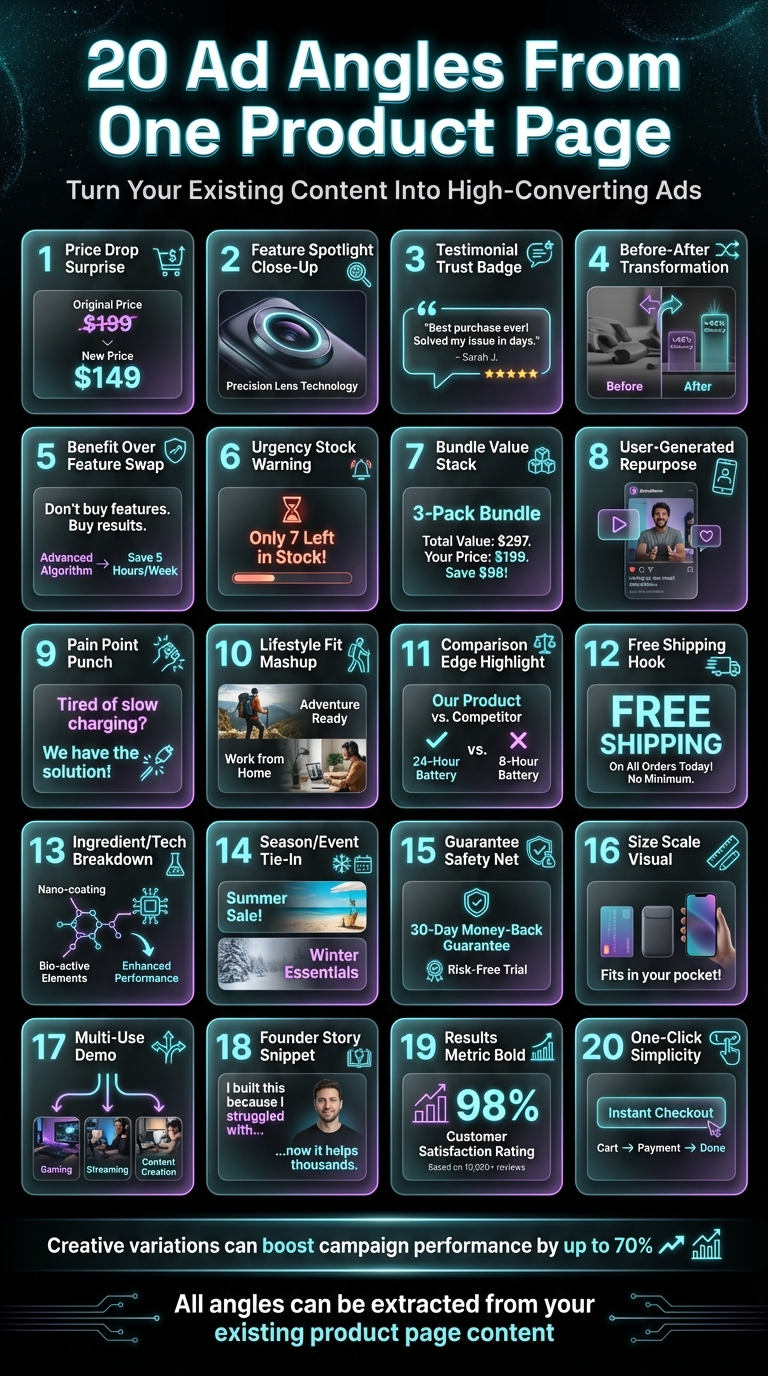
20 Ad Angles You Can Extract From Your Product Page
17 Proven Hooks And Angles You Can Utilize In All Your Ads ($10,000/Day Facebook Ads Campaign)
Put the playbook to work
Apply this playbook to your page
Paste your website and the Lab will turn the strategy you are reading into a ready-to-test ads.
Free to try No prompt writing
Why Your Product Page Is Already a Creative Goldmine
Most advertisers see their product page as a static endpoint - a place customers land after clicking an ad. But here's the thing: your product page is more than just a sales tool. It's a treasure trove of creative ideas waiting to be repurposed. Every element - star ratings, before-and-after photos, FAQ sections, ingredient lists, shipping details - can be transformed into a standalone ad that speaks to different customer motivations.
The problem? Many marketers try to extract these ideas manually and miss the mark. They might copy a basic feature list into an ad, only to wonder why it doesn't resonate. Or they ignore glowing customer reviews because pulling out individual testimonials feels like a hassle. That’s a mistake - especially since 93% of consumers say online reviews influence their buying decisions. Skipping over this social proof leaves money on the table.
Another misstep is focusing too much on technical features instead of benefits. Sure, your product page might boast specs like "moisture-wicking fabric" or a "dual-core processor", but customers care about what those features do for them. For instance, they’re not buying the fabric - they’re buying the confidence of staying fresh during a long presentation. Ads that emphasize what a product is, rather than the life-changing outcomes it offers, often fail to connect.
This misalignment can also extend to messaging. Imagine an ad that promises, "Find clients in 15 minutes", but the product page it links to talks vaguely about business growth strategies. When the ad's promise doesn’t match the page’s message, you lose the trust of potential customers - and waste your ad budget. This disconnect happens far too often when ad concepts are brainstormed in isolation, instead of being inspired by what's already working on your product page.
Your product page is also packed with urgency triggers that drive conversions. Phrases like "Only 3 left in stock" or "Free shipping over $50" create a sense of immediacy and reduce hesitation. These signals are crucial because today’s customers expect instant trust. Without them, you risk losing buyers - 47% of consumers abandon their carts due to concerns about a brand’s legitimacy. Leveraging these elements isn’t just helpful; it’s essential for boosting conversions. Up next, we’ll dive into how to scale winning ad angles without overcomplicating your workflow.
1. The Price Drop Surprise
A price drop isn’t just a discount - it’s a powerful psychological nudge that sparks immediate action. Seeing something like “$79 ~$129~” in a social feed instantly triggers the feeling of saving money. That emotional pull often leads to clicks faster than almost any other tactic.
The magic lies in showing the original price with a strikethrough right next to the new price. This technique, known as price anchoring, uses the higher price as a reference point, making the discount feel more impactful. Without that visual comparison, a $79 product is just... $79. But add the strikethrough, and suddenly it’s a $50 savings opportunity.
However, many advertisers make the mistake of showing the price drop without explaining why it’s valuable. A discount alone might leave people questioning the product’s quality. That’s why pairing the price drop with a clear benefit works so much better. Instead of just saying “25% off,” try something like:
- “25% off - now with free 2-day shipping”
- “Save $50 on our best-selling moisture-wicking shirt”
This combination reassures potential buyers while giving them an extra reason to act.
What makes this strategy even more effective is systematic testing. By leveraging automated creative tools, you can experiment with multiple variations - different benefits, visuals, and messaging - without the usual production delays. This approach not only saves time but also drives stronger ROAS improvements.
Let automation do the heavy lifting. Pull the discount straight from your product page, pair it with a compelling benefit, and let Meta’s algorithm zero in on the audience that responds best. No guesswork, no manual tweaking - just data-driven results.
2. Feature Spotlight Close-Up
When it comes to dynamic pricing strategies, zeroing in on individual features can make your messaging much more impactful. While your product pages might list a variety of features, cramming all of them into a single ad can dilute their effect. Instead, focus on one specific feature per ad. For instance, if you're marketing a water bottle, one ad could emphasize its insulation technology, another could highlight the leak-proof cap, and a third might showcase its easy-grip texture.
Why does this work? It allows Meta's algorithm to better match your message to the right audience. By testing multiple feature-focused ads at the same time, the platform identifies which benefit resonates most with different audience segments. For example, someone searching for gym essentials might respond to the easy-grip feature, while a commuter might be drawn to the leak-proof design. This isn't guesswork - it's data-driven precision.
The effectiveness of this strategy is well-illustrated by TechGadget Pro. In 2024, their Growth Director, Mike Rodriguez, shifted from generic product overviews to ads that spotlighted individual features. The shift led to a 520% increase in CTR, $1.8M in additional revenue, and a 45% reduction in CPC. As Rodriguez explained:
"The AI understands our tech audience better than any human designer ever could".
The process is straightforward: identify the standout benefits from your product page, isolate them, and let automation take over. With AI tools for Meta ads that generate ready-to-launch creatives, you can quickly produce ads highlighting different features - all without lengthy design briefs or revisions. Understanding the psychology of social proof is key to this transition. Up next, we'll dive into how social proof can further refine your ad strategy.
3. Testimonial Trust Badge
Your product page reviews are more than just social proof - they're ready-made ad copy with built-in credibility. The difference between a generic "Buy Now" ad and one that truly converts often comes down to a single customer quote that tackles the exact hesitation holding someone back.
The mistake most brands make? Letting testimonials stay hidden on the product page. A smarter approach is to pull out quotes that address common objections, not just generic praise. For example, instead of "Great quality!", aim for something like, "I used to spend 20 minutes scrubbing my pans, now it takes 10 seconds". That’s a powerful before-and-after story in one sentence.
Here’s why this works: shoppers who engage with reviews convert 161% more often, and using reviews in ads can increase conversion rates by up to 270%. Why? Because 92% of consumers trust recommendations from real people over traditional ads. Adding a "Verified Buyer" badge to these quotes boosts their impact even further, erasing lingering doubts and nudging people to click.
Want to make it even better? Pair the quote with a real customer photo instead of a generic icon. One A/B test showed that swapping in authentic images increased conversions by 48%. And don’t worry about perfection - a 4.7-star rating alongside genuine feedback feels more believable than a flawless 5.0, which can sometimes seem suspicious.
The process is simple. Pull reviews that answer key questions like "Does this actually work?" or "Is it worth the price?" and turn them into standalone ads. By creating multiple variations with different quotes, visuals, and hooks, you allow Meta's algorithm to determine which resonates best with each audience. This is a core part of Meta ad optimization that helps maintain performance over time. Automating these variations not only saves time but also keeps your ads fresh and effective. Next, we’ll dive into another way to keep your creative strategy engaging.
4. Before-After Transformation
Few things grab attention like a clear before-and-after transformation. It’s not just about visuals - it’s a direct way to answer the question every buyer has: "What’s in it for me?"
Your product page already holds everything you need to create this angle. The "before" is often reflected in FAQs or common objections, while the "after" shines through benefit statements and customer reviews. Take Dr. Amanda Foster, Founder of Wellness Plus, as an example. In 2025, she used AI to analyze emotional triggers and buyer psychology on her product page. The result? Her transformation ads boosted ROAS by 280%, added $3.1M in revenue, and slashed CAC by 72%.
The secret lies in making the transformation measurable. Instead of saying "better sleep", point to specifics like "fell asleep 40% faster." Or, rather than claiming "cleaner dishes", highlight something concrete: "10-second scrub versus a 20-minute soak." These numbers make the change feel real and achievable. By pulling these details directly from your product page, you can turn existing content into compelling, ad-ready proof. If you're stuck, you can use an ad creative idea finder to bridge the gap between your product page and new angles.
This strategy works because it connects emotionally before logic kicks in. Stories of similar successes further reinforce the effectiveness of before-and-after transformations, showing how reusing product-page insights can consistently deliver results.
And here’s the best part: you don’t need a high-budget production. Use an "in-action" image from your product page, pair it with a customer quote contrasting life before and after, and you’ve got a ready-to-go ad. The key is keeping the transformation specific, believable, and tied to a real pain point your buyers care about.
5. Benefit Over Feature Swap
Product pages often focus on listing what a product has. But the real magic happens when you shift the focus to what the product does for the buyer.
Take this example: a feature might be "AI-powered coaching." Sounds fancy, right? But the benefit? "Get fit faster without guessing." One is a technical detail; the other tells the buyer exactly how their life improves. Both are important, but emphasizing the benefit makes the value crystal clear. This approach not only highlights the product's appeal but also simplifies creative processes. Scan through your product descriptions, FAQs, or even image captions. Spot a technical detail? Ask yourself, "So what?" The answer will reveal the core benefit - your key to connecting with customers.
Sarah Chen, CMO of Fashion Forward Co., experienced this firsthand. Her team initially focused on listing fabric specs and stitching techniques. Then they switched gears by using an ad copy idea generator to highlight benefits pulled directly from product pages. Instead of saying "wrinkle-resistant polyester blend", they showcased "stays wrinkle-free through your entire workday." The results? Stunning. In just one day, they produced over 200 ad variations, achieved a 340% increase in ROAS, cut customer acquisition costs by 67%, and added $2.3M in revenue.
The impact is hard to ignore. As FasterCapital puts it, "People make decisions based on emotions, not logic". Features might justify a purchase, but benefits are what drive action. To make benefits even more compelling, quantify them: "fell asleep 30% faster" or "cut prep time from 20 minutes to 5." Numbers make the benefit feel real.
Here’s a quick tip: take a technical feature from your specs and pair it with a customer review that explains the outcome. This instantly creates a benefit-focused angle without hours of brainstorming. The question to keep asking is simple: "What's in it for me?"
6. Urgency Stock Warning
Urgency gets people to act fast. Phrases like "Only 3 left in stock" or "Low inventory - order soon" can nudge users into making quicker decisions.
If certain SKUs or sizes are selling quickly, that’s a perfect opportunity for an ad angle. The key here is honesty. Make sure the urgency in your ad reflects the actual stock levels on your landing page. If there’s a mismatch, Meta could flag your account for misleading practices.
To pull this off, sync your ad copy with real-time stock data from your backend. If your ad claims limited availability, your product page must back it up. Consistency between your ad and landing page isn’t just about trust - it also ensures smoother ad performance.
Stock warnings also help Meta’s algorithm by triggering psychological cues that build interest-based audiences for better targeting.
For the best results, blend urgency into your broader ad message naturally. And here’s a quick pro tip: skip the ALL CAPS and excessive emojis. Meta’s system tends to label such tactics as low-quality, which can hurt your reach and increase your CPMs. Stick to clear, honest messaging and let genuine scarcity speak for itself.
7. Bundle Value Stack
Bundles make shopping easier and more appealing by presenting a complete solution rather than a collection of individual items. For example, offering a "Complete Skincare Routine" or a "Home Office Starter Kit" helps customers see the value in a ready-made package instead of figuring out what they need piece by piece.
Bundling also plays into the human tendency to seek value. By grouping items together, you create a perception of getting more for less. Interestingly, people often underestimate the total they've purchased, which can lead them to feel even better about adding more to their cart.
The numbers back this up: businesses that use bundling strategies often see a 30% boost in revenue. For some brands, bundles contribute between 10% and 30% of their total eCommerce revenue when executed effectively.
Chances are, your product page already includes bundle suggestions, cross-sells, or a "frequently bought together" section. These elements are goldmines for crafting ads. Highlight the savings by showing both individual and bundle prices. For instance, "Save $22 when you buy all three" creates a sense of value through price anchoring, which can nudge customers toward a purchase. Plus, these bundles integrate seamlessly into automated ad creation tools, and distinct visuals make them easily recognizable by Meta’s algorithm.
To make bundles work, group items that naturally go together. A "New Puppy Essentials" kit feels logical and helpful, while throwing together unrelated items just to hit a discount target can feel forced. When bundles solve a specific problem, they come across as thoughtful recommendations, which boosts their conversion potential.
When advertising on Meta, use unique visuals for each bundle. Changing the layout, product arrangement, or background ensures Meta’s algorithm treats each ad as distinct. This prevents the platform from assigning the same unique identifier to multiple ads, which could limit their reach.
8. User-Generated Repurpose
Your customers are already creating content about your product - whether it’s unboxing videos, Instagram story posts, or detailed reviews with pictures. These gems often go unnoticed, but they can inject fresh energy into your campaigns.
User-generated content (UGC) tackles a major issue in Meta advertising: creative similarity. Meta’s system groups ads that look too much alike under one "Entity ID." When this happens, your new ads are treated as if they’re old, which can hurt performance. UGC brings natural variation - different lighting, settings, and personal touches - that gives Meta’s algorithm something new to work with.
The stats back this up. About 60% of consumers believe UGC is the most authentic form of advertising, while 70% of Gen Z buyers find it very helpful when making purchase decisions. Even more striking, UGC influences purchasing decisions 8.7x more than influencer content and 6.6x more than branded content. For example, Petco’s "Spotted" sampling program, which sent products to pet parents, led to a 405% increase in review volume and a 48% jump in revenue per visit for those products.
Chances are, your product page already has a goldmine of customer photos in the reviews section or testimonials featuring real names and faces. Use these! Transform written reviews into quote graphics or create short video clips for Reels. Just make sure to get permission and credit the original creator when repurposing their content. This builds trust and motivates more customers to share their experiences.
9. Pain Point Punch
Your product page likely highlights the problems your customers face - why not turn those into compelling ad hooks? Start your ad with a relatable frustration, like "Tired of waking up with neck pain?" This approach shifts the focus directly to the benefit your product provides, rather than listing features. As Sam Tomlinson explains:
"Precisely ZERO prospects care about your features. They care about what those features do for them (AKA Benefits)".
Take a closer look at your product FAQs and customer comments. These are goldmines for uncovering the exact language your audience uses to describe their struggles. For example, a common complaint like "my old blender couldn't crush ice" can be transformed into a powerful hook. Using this kind of specific, relatable language in your ads can make a big impact - personalized calls-to-action based on real frustrations have been shown to increase conversions by 202%.
However, it’s important to remember that not all audiences share the same pain points. For instance, parents of middle schoolers face different challenges than parents of college students, even if they’re buying the same planner. Similarly, a marketer’s struggles won’t mirror those of someone grappling with audience targeting. Tools like Aden’s Lab can help you take these nuanced frustrations and turn them into high-performing ad creatives tailored to specific audience segments, while scaling Meta ads with AI budget allocation ensures your spend follows the best-performing angles.
Once you identify a pain point, reinforce it with clear proof. If your product page promises it "lasts 10 years," your ad might say, "Stop replacing cheap tools every season." By linking frustrations to concrete benefits, you could see click-through rates jump by as much as 50%. And there’s more - tying these insights into lifestyle contexts can take your engagement even further.
10. Lifestyle Fit Mashup
Your product page already shows where your product fits into daily life - you just need to bring that same vibe into your ads. Take a closer look at the photos on your page. Is someone using your water bottle at the gym? Your planner at a cozy coffee shop? Your skincare in a bathroom with candles and plants? Those details aren’t accidental - they’re lifestyle cues that quietly say to specific people, “This is made for you.”
Customer reviews take it a step further. People naturally share how they use your product: “I bring this to yoga three times a week” or “It’s perfect for my morning commute.” That’s not just feedback - it’s an ad idea waiting to happen. When you reflect that exact context in your creative, it feels like you’re speaking directly to someone living that same routine. And with over 80% of consumers now expecting tailored experiences from brands, showing your product in their world is one of the quickest ways to connect.
The common pitfall? Trying to appeal to everyone. A yoga mat isn’t just for “people who exercise.” It’s for the 6 a.m. home workout crowd, the studio regulars, or even the travel minimalists. Each group has unique habits and priorities. If your product page highlights sustainability or cruelty-free ingredients, make that a focal point. If it showcases versatility, break those scenarios into separate ads. As Dominick Sorrentino from Brafton explains:
"Drop the jargon and soulless language... Whoever's reading your content needs to feel like you care about the topic on a personal level".
Once you pinpoint the lifestyle themes that resonate most - whether through reviews, user-generated photos, or your existing imagery - you can craft ads that feel less like traditional marketing and more like a snapshot of someone’s actual day. Aden's Lab takes this approach by pulling these lifestyle contexts straight from your product page and turning them into feed-native creatives that feel like they belong in someone’s scroll, rather than interrupting it.
11. Comparison Edge Highlight
Let’s talk about how clear comparisons can make your ads stand out. Your product page already highlights what makes your offering special - whether it’s faster shipping, better ingredients, or a lower price. By using these strengths in direct comparisons, you can help potential buyers make quicker decisions. After all, customers are always weighing their options, comparing your product to what they’ve bought before or what else is on the market.
Here’s a common pitfall: trying to compare everything at once. Instead, zero in on one standout feature - like "no fillers", "ships same-day", or "half the price of premium brands" - and build your ad around that. Features like "cruelty-free" or "made in the USA" aren’t just nice extras; they’re powerful decision-making factors. Using these as focal points can transform the strengths already highlighted on your product page into compelling ad content.
Take Fashion Forward Co., for example. When they moved away from generic agency ads and started focusing on speed and cost in their messaging, they saw major improvements in both CPA and revenue.
The best comparison ads don’t tear down competitors - they present clear, straightforward facts. Instead of vague claims of superiority, give potential buyers something concrete. For instance: "$9 for 10 ads in 90 seconds" versus "$1,000+ for 10 ads in 2 weeks." This kind of direct comparison gives people a solid reason to choose your product.
Another great example is Mike Rodriguez. He cut his $50K monthly spend on agencies down to $500 with Aden's Lab and saw a jump in CTR and revenue. Clear comparisons like these set the stage for the final piece of your creative strategy.
12. Free Shipping Hook
Here’s a fact that many advertisers overlook: the word "free" has a powerful pull on shoppers. Offering free shipping doesn’t just feel like a nice bonus - it makes the entire product seem more appealing. Shoppers often perceive more value in a product with free shipping than in one with a comparable discount. It may not be entirely rational, but the impact is hard to ignore.
Let’s look at the numbers. 9 out of 10 online shoppers rank free shipping as the most important factor when deciding to buy. Even more striking, 39% of shoppers abandon their carts because of unexpected shipping fees. If your product page quietly mentions free shipping in the fine print, you’re missing an opportunity. Highlighting it in your ad creative can eliminate friction before it even begins.
But there’s more to this tactic than just plastering "free shipping" on every ad. Conditional offers like "Free shipping on orders over $50" not only reduce barriers but also encourage shoppers to spend more. For example, if your average order value is $45 and you set the free shipping threshold at $50, you’re not just covering the shipping costs - you’re increasing the average cart size. One test found that promoting "$35 with free shipping" doubled conversions compared to "$30 + $5 shipping", even though the total cost was identical.
Free shipping also shines in retargeting campaigns. For visitors who didn’t complete a purchase, a free shipping offer can be far more effective than generic reminders. Research shows that free shipping retargeting boosts purchase rates by 18.6% and improves targeting profitability by 28.2%. That’s not just a small improvement - it’s the difference between breaking even and turning a profit.
There’s a catch, though: free shipping can cut into your margins. For instance, if you’re spending $12 to ship a $75 order with a 35% margin, your effective margin drops to 19%. This pushes your breakeven ROAS from 2.86x to 5.26x. To avoid eroding your profits, test this strategy on a smaller scale first. Tools like Aden’s Lab make it easy to create a free shipping ad in just 90 seconds. You can test the waters for under $100 and quickly see if the conversion lift offsets the cost. It’s a low-risk way to gauge whether free shipping is the boost your campaigns need.
13. Ingredient/Tech Breakdown
Most product pages already mention what's inside or explain how a product works - but this information is often buried. By bringing these details to the forefront in an ad, you're not just listing specs; you're building trust and giving shoppers a clear reason to see the value in your product.
This strategy works particularly well in crowded markets where many brands make vague "premium" promises. Instead of generic claims, focus on the specifics - like the titanium used in golf tees or the simple ingredients behind artisan bread. This level of detail shows genuine transparency. As Izzy Seidman from Flyte New Media puts it:
"The best loaf of bread is made with just flour, water, salt, and the creativity of wild yeast".
Specific and honest details like these connect with people because they feel real.
Take Ametller, a high-end grocery business, as an example. The agency FEEDBACK used automated ad creation to highlight over 100 products with ingredient-focused messaging. They personalized 2,000 video ads using postal codes and weather data, achieving a 58% increase in ROAS and a 30% reduction in CPA. The success wasn’t just in showcasing the products but in breaking down what made them stand out and delivering that message in a way that felt relevant to each viewer.
For ads like these, keep visuals clean and focused. In video ads, emphasize the most striking detail within the first few seconds, and use captions to ensure the message lands even without sound. Aden's Lab takes a similar approach, transforming product page details into high-performing ad creatives in seconds. It outperforms manual vs automated ad creation, turning existing information into attention-grabbing ads that stop the scroll.
14. Season/Event Tie-In
Your product page might not change, but your audience's mindset definitely does as seasons shift. For example, a winter coat bought in November signals planning ahead, while a February purchase hints at last-minute urgency. Seasonal tie-ins work because they connect your product to moments your audience is already living, making your ads feel timely and relevant.
Here’s the thing: 90% of consumers make unplanned purchases during the holiday season, often driven by emotions like urgency or the joy of giving. Even more interesting, 34% of holiday purchases happen while shoppers are browsing, meaning your ad's role is to nudge them into action rather than build a case from scratch. Campaigns that tap into these emotional triggers can deliver a 7x higher ROI compared to those focused solely on features or logic.
But timing is everything. A common mistake? Launching Christmas ads too late. In 2022, 56% of US consumers started holiday shopping as early as October. And while seasonal imagery can help, it’s not about going overboard. Simple shifts in messaging - like “Start the new year with something new” or “Make the holidays unforgettable” - can tie your product to the season without feeling forced. The goal is to keep things seasonal without piling on extra work.
That’s where Aden's Lab steps in. Just drop your product page link into the platform, and it automatically crafts seasonal ad angles based on your existing content. No need to manually tweak visuals or copy - it transforms what’s already working into fresh, timely ads with ease.
15. Guarantee Safety Net
Let’s face it - your return policy or money-back guarantee is probably buried somewhere on your product page, and a lot of advertisers miss out on its potential. A good guarantee doesn’t just promise refunds; it tackles the fear of making a bad choice. For someone new to your brand, it’s not just the product they’re judging - they’re also weighing the risk. A well-communicated guarantee can wipe away that uncertainty in seconds.
Here’s the thing: people are naturally more driven to avoid loss than to chase gains. A 30-day money-back guarantee doesn’t just say, “You’ll get your money back.” It says, “You’ve got nothing to lose by trying this out.” Studies even back this up - money-back guarantees can increase purchase intent, justify higher pricing, and ultimately lead to better sales and profits.
But how you present your guarantee is where the magic happens. Instead of a bland “100% satisfaction guaranteed,” why not say something like, “Try it risk-free for 30 days - if you’re not thrilled, we’ll refund every penny”? That kind of language flips a standard policy into a safety net that builds confidence. It doesn’t take extra effort - just a little creativity in how you phrase it.
The tricky part? Making your guarantee the star of your ads. It needs to be bold, clear, and impossible to miss. Whether it’s a trust badge or a headline that screams “risk-free,” the goal is to make buyers feel secure and ready to take the plunge.
And here’s where Aden’s Lab steps in. It simplifies the process by pulling your guarantee directly from your product page and turning it into ad creatives that spotlight your refund policy, satisfaction promise, or warranty. Just drop your link, and Aden’s Lab does the rest - creating ads that convert cautious shoppers into confident buyers, no extra effort required.
16. Size Scale Visual
Here’s something many advertisers overlook: 88% of online shoppers say product size and dimensions are a leading reason for returns. That’s a huge problem - returns mean lost revenue, all because buyers couldn’t accurately picture what they were getting. When shopping online, customers can’t pick up your product, turn it over, or hold it. All they have are images and measurements, which often feel abstract and hard to interpret.
This is where size scale visuals can make a big difference. By showing your product next to something familiar - a hand, a coin, a smartphone, or even a coffee mug - you provide an instant sense of scale. People process these comparisons in less than a second. No need for mental math or second-guessing. A ring on a finger, a portable speaker in someone’s hand, or a skincare bottle beside a quarter - these aren’t just clever visuals. They’re practical tools that remove uncertainty and make buying decisions easier.
The good news? You likely already have these types of images on your product page. Many e-commerce sites feature products in hands, on shelves, or in lifestyle settings. If you don’t, it’s easy to fix - grab your phone and take a quick photo of your product next to a common object. No need for a professional photoshoot. Just 10 minutes of effort can transform how customers perceive your product.
Pair these visuals with straightforward copy. Say things like, "Smaller than you think", "Fits in your pocket", or "Actual size shown." Avoid overly generic phrases that don’t add value. The combination of a clear image and direct copy stops shoppers in their tracks because it answers a question they didn’t even realize they had.
Using size scale visuals doesn’t just simplify the buying process - it also speeds up your ad creation. Before you go live, follow a pre-launch ad checklist to ensure everything is optimized. Tools like Aden’s Lab make it even easier by pulling these scale images directly from your product page and turning them into ready-to-use ads. No editing, no back-and-forth with designers. Just drop in your link, and it automatically finds the best images to showcase size context. It’s a quick, budget-friendly way to test this approach without extra effort.
17. Multi-Use Demo
Most products can solve more than one problem, but many ads focus on just one feature, leaving potential buyers untapped. Take a kitchen tool, for example. If it’s only advertised as a vegetable chopper, you’re missing out on the audience who might need it for mixing or serving. Highlighting multiple uses allows you to connect with different parts of your market.
Start by digging into your product’s feature bullets, customer reviews, or FAQs to uncover surprising ways people use it. For instance, a brand might market a bag as "perfect for work", but reviews might show customers also use it for gym sessions, weekend getaways, or grocery shopping. That’s three unique advertising angles you can use right there. This demonstrates how even the smallest details on your product page can inspire standout ads.
The way you present these multi-use demos is crucial. A quick sequence works best: show three scenarios, each lasting 2-4 seconds, with simple text overlays like "Meal prep. Storage. Travel." Keep the text short and let the visuals do most of the talking. Trying to cram more than three use cases into one ad can overwhelm viewers. If you have more than three, break them into separate ads tailored to specific audience segments instead.
This isn’t just a theoretical idea - it’s backed by results. In March 2026, Fashion Forward Co. created 200 ad variations in just one day. The result? A 340% boost in ROAS and an additional $2.3M in revenue. The success came from showcasing versatility while letting Meta’s algorithm match the right use case to the right audience.
Tools like Aden's Lab make this process even easier. By analyzing your product page, it automatically identifies different applications from descriptions and images, then structures them into quick, ready-to-launch demo ads. No manual work - just a fast way to test multiple angles and find out what drives sales.
18. Founder Story Snippet
People connect with people, not logos. When a founder shares why they created something, it resonates in ways that polished product images simply can't. The story doesn’t have to be dramatic - it just needs to feel real. Often, founders create products because they’ve faced ineffective solutions or noticed a glaring gap in the market. That straightforward reasoning is often enough to grab attention.
Instead of diving into the entire company history, focus on one specific problem the founder personally dealt with. A short, focused clip - around 10 seconds - is far more impactful than a lengthy 2-minute backstory. Show the founder holding the product, explaining what was lacking before and how they decided to fix it. Keep it simple - a vertical smartphone video works perfectly for social feeds and instantly builds trust.
Highlighting a personal challenge makes the story relatable and memorable. This approach works because it adds a layer of accountability. When buyers see a face behind the product, they feel like they’re dealing with someone who genuinely cares - not just a faceless company. It also taps into a natural tendency to trust people who share similar values or experiences, creating an instant connection. This personal touch not only makes your brand feel more human but also boosts the credibility of your ad.
The formula is straightforward: use a Problem-Agitate-Solve framework. Start by addressing the frustration, emphasize why it matters, and then introduce the product as the solution. Keep the visuals simple and well-lit - raw, unpolished content builds trust faster, especially when using AI tools for ad asset creation to streamline the process.
ADEN'S LAB takes founder story angles straight from your product page, pulling details from your "About Us" section, ingredient lists, or mission statement. Just drop a link, and the platform pinpoints emotional hooks worth testing, saving you the hassle of scripting it yourself.
19. Results Metric Bold
We’ve explored how small, thoughtful adjustments can drive engagement, but adding concrete numbers takes persuasion to another level.
Numbers grab attention faster than any clever headline. For instance, when someone scrolling through Instagram spots a metric like “4.9/5 from 10,000+ reviews” or “90% saw results in just 2 weeks,” they’re more likely to stop and take notice. Vague promises won’t cut it - specific, measurable data is what convinces people.
Your product page is already packed with gold: star ratings, review counts, clinical trial results, and sales figures. The trick is to spotlight the most compelling metric and make it the star of your messaging. Don’t let a stat like “over 5,000 sold” get buried in the fine print - elevate it to headline status and use visuals to amplify its impact.
Here’s a tip that underscores this point:
"Display the rating as a number, not just as stars. Doing so makes it clear to customers what your product's rating is without the guesswork." – SplitBase
Metrics eliminate uncertainty. A statement like “90% reported clearer skin” doesn’t just inform - it reassures. It shifts the question from “Is this product any good?” to “Will I be part of that 90%?” That’s the kind of confidence that drives conversions.
20. One-Click Simplicity
This approach shifts the spotlight from product features to making the buying process effortless.
Friction is the enemy of conversions. Imagine someone on Instagram tapping an ad only to land on a checkout page with multiple steps - most people won’t stick around. In fact, cart abandonment hovers around 70% because buyers don’t want to jump through hoops to complete a purchase. That’s why your product page likely already includes tools like Apple Pay, Google Pay, or "Buy Now" buttons. The trick? Bring these elements into your ad creative to promise a smooth, hassle-free experience.
Take Allbirds as an example. Their product pages showcase payment options right from the start, with clear icons for one-tap buying. When they paired this approach with user-generated content in their ads, mobile conversions increased by 15%. Why? Because the simplicity was immediately obvious. Tools like Aden's Lab can even auto-sync your checkout features to ensure your ad delivers the same effortless buying experience.
To make this work, use a bold, oversized one-click button in your ad with clear text like "Buy in 1 Tap – Free Shipping." This small tweak can reduce decision fatigue and boost click-through rates by 20–30%. The goal is to make the purchase process feel so easy, it’s almost as if it’s already done.
Here’s a common mistake advertisers make: if your product page offers instant checkout, your ad should highlight that. Skip generic CTAs like "Shop Now" and instead test phrases or use an ad headline generator to create high-converting copy like "Buy in 1 Tap – Free Shipping." These action-driven messages resonate better, driving 28% higher CTR because they reflect the actual seamless experience.
How to Test All 20 Angles Without Burning Out
After dealing with the challenges of manually creating ads, I came up with a system that transforms your product page into a hub for ad creativity. Testing different ad angles is essential for quickly identifying what works. By running 10–20 ad creatives simultaneously, Meta's algorithm can pinpoint top performers within just 24–48 hours based on metrics like click-through rate (CTR) and return on ad spend (ROAS). But here’s the catch: producing those creatives manually is time-consuming and expensive. Agencies often charge over $1,000 for 10 ads and take weeks to deliver, making it hard to test enough variations to see what truly drives conversions.
This slow, manual process limits your ability to try multiple angles. Instead of waiting weeks for results, imagine being able to test and iterate in a single day. That’s the kind of speed that can transform your campaigns.
Enter Aden's Lab. This tool completely removes the production bottleneck. All you need to do is drop your product page link, and within 90 seconds, it generates 20+ static Meta ads using your existing content - like prices, testimonials, images, and key features. This automated process allows you to test a variety of ad angles, such as "Urgency Stock Warning," "Before-After Transformation," and "Pain Point Punch," letting real data - not guesses - guide your strategy.
The cost savings are just as impressive. With the Apex Mode plan, ads cost only $0.90 each. That means for $179 a month, you can generate 200 ads - far cheaper than what agencies charge for a single campaign. Some brands have cut their creative budgets from $50,000 to just $500 per month while still improving performance. It’s proof that efficiency doesn’t have to compromise results.
The workflow is straightforward and designed to keep you focused on scaling. Paste your link, launch your ads, and within 48 hours, identify and discard the underperformers. This rapid cycle ensures you’re always working with data-backed winners. By cutting production time from weeks to minutes, you’ll avoid burnout and have more energy to focus on scaling what works.
Conclusion
Your product page is more than just a place to sell - it’s a treasure trove of ad ideas. Every single element on that page can be turned into a fresh ad angle. That means you’ve got 20 different ways to connect with your audience without starting from scratch or paying for costly design revisions.
The traditional approach to ad creation - briefing agencies, waiting weeks, and spending thousands - just doesn’t keep up with the speed Meta’s algorithm demands. Creative variations can boost campaign performance by up to 70%. Brands that can quickly test and refine multiple angles will always stay ahead of the competition.
This is where Aden's Lab changes the game. By simply dropping your product page link, you can generate 20+ Meta ads in just 90 seconds, directly from your existing content. No back-and-forth, no delays. At just $0.90 per ad with the Apex Mode plan, it’s 95% cheaper than traditional agencies. This streamlined process makes ad testing faster and more efficient.
Think of creative production not as a monthly task, but as a daily cycle. Your product page is packed with untapped assets that can fuel consistent ad performance. The most successful brands test new angles daily, cut underperformers quickly, and scale their winners faster. Don’t let your competitors get there first - start leveraging your product page today.
FAQs
Which parts of my product page should I turn into ads first?
When crafting your product page, pay extra attention to the elements that influence purchase decisions the most: product images, key benefits, and descriptions that spark interest. Use high-quality lifestyle images that showcase the product in action - these can catch the eye and encourage more clicks. Focus first on your top-selling or standout products, especially those with a strong visual hook or something that sets them apart. These make for ads that connect with your audience and drive conversions.
How many ad angles should I test at once on Meta?
Testing 3 to 5 ad angles simultaneously strikes the right balance. This range gives you enough data to identify which angles perform best without overstretching your budget. Testing too few won't provide meaningful insights, while testing too many can dilute your spend, making it harder to pinpoint clear winners.
How do I keep ad urgency claims from being misleading?
When promoting time-sensitive deals, it's important to stick to clear, factual language. If you're running a limited-time offer, specify the exact deadline or conditions. For instance, instead of saying "Hurry, time is running out!" try something like "Offer ends October 31, 2023, at midnight."
Avoid vague or exaggerated claims, as these can not only create confusion but may also lead to ad rejections or even account issues with Meta. Transparency doesn't just help you comply with policies - it also builds trust with your audience, making them more likely to engage with your brand.
Your next ad batch starts here
Finish with a ready-to-test ad batch
Paste your website to generate static creatives. Drop the link → get ads in about 90 seconds → upload them to Meta → scale.
Free to try No prompt writing