Meta Ad Prompts for Subscription Box Brands
Use the prompts on your real offer
Generate these ad angles for your product
Skip the blank prompt box. Paste your product page and ADEN'S LAB applies the angles to your offer, images, headlines, and copy.
Free to try No signup No prompt writing

Subscription box ads on Meta fail when they hide the part buyers care about most: what ships now, what repeats, and what the next charge looks like. This page fixes that with a tighter way to brief static ads. The goal is not more concepts. The goal is a first batch of ads that each answer one buying objection with page-backed proof. For subscription offers, that usually means contents, repeat-payment logic, fit, and terms. The clean path is simple: verify the live landing page, choose one angle per ad, then paste the URL into ADEN'S LAB to pull page visuals and messaging, generate static ad options using AI tools, review them, and test the ones that stay inside the offer.
What to Verify Before You Turn Any Subscription Box Page Into Ads
Check the live landing page before turning any subscription box offer into ads. The ad can only say what the destination page supports.
If the ad says $200 value for $45, the page needs to show the item list and the math behind that number. That keeps the prompt library focused on angles, not cleanup after bad claims.
This matters most in the three places subscription-box ads tend to go off track:
- What’s in the box
- What repeats
- What changes by plan or location
Lock these facts from the live page before building any concept. Each one feeds the prompt groups used later: reveal, value, fit, transparency, and offer.
| Fact to verify | What to confirm |
|---|---|
| Price | Exact USD amount per box or per billing cycle, per plan |
| Billing frequency | Monthly, quarterly, or other - stated explicitly |
| Auto-renewal | Whether the subscription renews automatically |
| Shipping | Flat fee, free shipping threshold, or regional variation |
| Intro offer | Exact discount amount or trial terms; whether a card is required at sign-up |
| Cancellation | Deadline to cancel before next charge, how to cancel, and any fees |
| Personalization | Which items or categories the subscriber can choose, and which are fixed |
| Availability | Whether shipping is nationwide or state-restricted |
| Box value claim | The exact items and math behind any stated retail value |
| Pictured contents | Whether the image shows the current box, a past box, a sample, or plan-specific contents |
A common failure point is the product image. Subscription box ads often use a clean flat-lay that looks like the box, then the click lands on a page where those items came from a past shipment or a styled sample. That can work, but only if the ad says so clearly: Contents vary. Past box shown. Or: Sample items. Current box contents listed on the landing page. The visual should never suggest that every buyer gets exactly what’s pictured when that’s not how the offer works.
Savings claims, renewal terms, and satisfaction language also need support on the current page. If terms shift by plan, region, or shipping destination, that needs to show up in the ad or in the destination-page copy. No guessing. No filling in blanks from older promos or past campaign docs.
This is also where the workflow should stay tight inside ADEN'S LAB. Paste the supported product or landing-page URL, let the tool pull the available visuals and page messaging, then build static concepts from what is actually on-page. Review the outputs, download the ones that match the verified facts, and test only the ads that clear this check. That’s the clean handoff from page review to static Meta production.
Use this checklist before writing the 25 prompts below. If anything is missing, vague, or split across plans, confirm it first. That avoids weak hooks built on claims the page can’t carry.
Once these facts are locked, the next section shows how to use the prompt library without repeating angles.
sbb-itb-628c49f
Put the playbook to work
Apply this playbook to your page
Paste your website and the Lab will turn the strategy you are reading into a ready-to-test ads.
Free to try No signup No prompt writing
How to Read the Prompt Library Without Repeating Angles
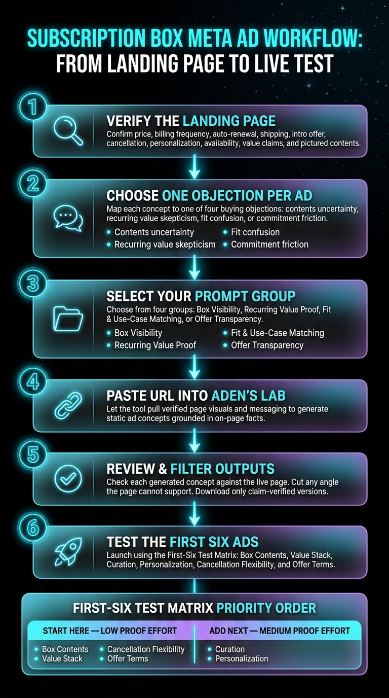
Subscription Box Meta Ad Workflow: From Landing Page to Live Test
Once the facts are locked, give one objection to one concept. That’s the core rule.
Each prompt should test a single ad angle you can learn from, not just another version of the same ad. Swapping a headline, image crop, or CTA does not create a new angle if the underlying sales point stays the same.
The clean way to read the library is to map every concept to one of four buying objections:
- uncertainty about contents
- skepticism about recurring value
- confusion about fit
- friction around commitment
The prompt groups follow that structure: box visibility, recurring value proof, fit and use-case matching, and offer transparency. That matters because it stops the team from making five ads that all say the same thing in slightly different words.
Use one verified box, or a clearly labeled illustrative example, to anchor the prompts. The goal is simple: move from a verified landing page to a static Meta ad with a clear hook, visual direction, overlay, and copy angle. The five fully worked source-to-output concepts below show that path in practice. That sequence leads into the five fully worked source-to-output concepts below.
For execution, keep it tight. Paste the landing-page URL once into ADEN'S LAB, and the tool turns the verified page into a first batch of ready-to-test static ads. The prompt library decides what to test. ADEN'S LAB handles production.
If two ideas attack the same objection in the same way, cut one.
1. Box visibility
Start with the clearest objection: what’s actually in the box?
For subscription offers, box visibility cuts doubt fast. If people can see the shipment, they spend less time guessing what they’re paying for. That matters even more on static Meta ads, where one image has to do a lot of work.
The goal is simple: show enough to reduce friction without suggesting every future box will match item-for-item.
- Flat-lay reveal, current box only: Photograph the items from one current shipment on a neutral surface. Add a simple overlay with the box or theme name plus "contents vary." This works when the offer needs a plain, direct visual.
- Opened-box first-person view: Show the box from the subscriber’s angle, lid open, tissue paper pulled back, and products visible but not fully removed. It feels immediate without overpromising. Overlay: "Your box just arrived."
- Product count callout: Use a clean grid with each visible item labeled by name. If the landing page states a count, label only the items shown. Don’t hint at extras that aren’t in the frame.
- Theme label as the hero: Lead with the printed theme card or insert, not the products. The theme name becomes the anchor, while the products sit behind it. This sells curation rather than one fixed assortment.
- Outer packaging close-up: Show the sealed, branded shipping box before it’s opened. Use curiosity, but don’t suggest the contents are being shown if they aren’t.
- Past-vs-current split panel: Place two shipments side by side, one past and one current, both labeled clearly. This is useful when variety is part of the pitch. It shows the subscription changes over time.
Here’s the practical filter: if the ad says or implies “this is what you get,” the image should match a current shipment and any variation should be called out in the creative itself. If the ad is selling the idea of rotation, curation, or discovery, the visual can lean more on theme, packaging, or past-vs-current contrast.
A simple matrix helps choose the right angle:
| Creative angle | Best use case | Main risk | Safe overlay |
|---|---|---|---|
| Flat-lay reveal | Current box needs clarity | Viewers assume all future boxes match | "Current box" + "contents vary" |
| Opened-box POV | Arrival moment, unboxing feel | Looks too fixed if unlabeled | "Your box just arrived" |
| Product count grid | Count is part of the offer | Overclaiming what’s included | Item names only for visible products |
| Theme card hero | Curation is the pitch | Products feel secondary | Theme name + current month/edition if accurate |
| Outer packaging close-up | Brand recognition, curiosity | Weak proof of contents | No reveal claim |
| Past-vs-current split | Variety over time | Confusion about what ships now | "Past box" / "Current box" |
This maps cleanly into ADEN'S LAB. Paste a supported URL, pull in the available visuals and messaging from the product or landing page, then generate multiple static creative concepts around one box-visibility angle at a time. For example, build one set from a current-box flat lay, another from packaging close-ups, and another from a theme-card-led image. Review the outputs, download the clearest versions, and test them as separate hooks instead of mixing all objections into one ad.
That separation matters. A flat lay answers what’s inside. A past-vs-current panel answers does it change over time. A theme-card hero answers what’s the curatorial idea. Keep each static ad focused on one job.
Once the contents are clear, the next objection is whether the box earns repeat payment.
2. Recurring value proof
Box visibility tells people what’s in the shipment. Recurring value proof handles the harder question: why renew at all?
Treat each angle below as its own brief. Don’t mash them together. Each one needs a clean claim, clear proof, and a visual that matches what the brand already says on-site.
- Value stack: Show several items from one shipment to show breadth, not one hero product. Hook: "One box. Multiple essentials." Visual: flat lay of the actual shipped items with simple labels. Required proof: use only the item mix and any value callout the landing page actually publishes. Overlay: total value or item count only when the page lists it plainly.
- Curation quality: Lead with the brand’s published selection standard, specialty focus, or named curator only if the site names one. Hook: "Curated for [specific use case]." Visual: one standout item plus the published criterion it meets. Required proof: the curation standard or curator role must appear on the official site. Don’t make up expertise.
- Personalization memory: Show that preferences carry forward over time. Hook: "Set it once. Get a better next box." Visual: a preference quiz screenshot or a customization/settings screen from the product page. Required proof: the landing page must describe personalization or preference memory. Overlay: "Customized to your profile" only if the brand says that word for word or close enough to support it.
- Work removed: Show the job the box takes off the customer’s plate, then show the box doing it. Hook: "Skip the research." Visual: a split panel - crowded store shelf on the left, clean branded box on the right. Required proof: the claim has to match what the service actually delivers. Don’t suggest the box solves every purchase in the category.
- Pause/cancel flexibility: Deal with cancellation friction head-on. Hook: "Pause or cancel per the posted terms." Visual: a screenshot of the account page showing the pause or cancel option. Required proof: use the exact pause or cancellation policy from the brand’s terms or FAQ. If there are conditions, the overlay needs to show them, not hide them.
- Reliability track record: Use tenure or scale only when the brand publishes it. Hook: "Trusted since [year]" only if that year appears on-site; if not, cut the hook. Visual: a clean brand mark or packaging shot with the stat as the main overlay. Required proof: the founding year, subscriber count, or another scale signal must come from the brand’s own published materials.
A simple rule keeps this section clean: if the claim isn’t on the page, cut the angle.
This is also where ADEN'S LAB fits neatly into the workflow. Paste a supported URL, let the product pull the available visuals and messaging, generate several static directions around one proof angle at a time, then review, download, and test only the ads that stay inside the published claim set.
| Angle | What to show | Proof source |
|---|---|---|
| Value stack | Multiple shipped items in one frame | Landing page item mix and posted value callout |
| Curation quality | Standout item plus selection standard | Official site language about curation or curator |
| Personalization memory | Quiz or settings screen | Product page copy about saved preferences |
| Work removed | Problem/solution split panel | What the service plainly says it handles |
| Pause/cancel flexibility | Account management screenshot | Terms, FAQ, or account policy page |
| Reliability track record | Packaging or brand mark with stat | Brand-published year, count, or scale signal |
Next: fit and use-case matching.
3. Fit and Use-Case Matching
Fit and use-case matching narrows the offer to one buyer, one recipient, or one job to be done. That constraint matters. Once a single ad tries to speak to the hobbyist, the gift buyer, and the busy household shopper at the same time, the message gets soft and the click gets less qualified.
Each angle below ties to a common recurring-purchase objection: fit, gifting, routine, convenience, or flexibility. Keep each concept locked to one profile. If the product page can’t back it up, don’t force it.
- The self-treating hobbyist: Hook: "Built for serious [hobby] fans." Visual: the box open on a dedicated hobby workspace - fly-fishing gear on a tying desk, skincare on a vanity shelf. Proof: brand's site describes the subscriber as a hobbyist or enthusiast. Don't claim professional-grade quality unless the page does.
- The gift sender: Hook: "Give a box instead of a gift card." Visual: branded packaging with a gift note insert - only if the brand ships gift packaging. Proof: gifting option on the checkout or gift page. Overlay only the published price.
- The routine builder: Hook: "Monthly delivery people can count on." Visual: a doorstep shot or delivery confirmation that reinforces the recurring schedule. Proof: billing and shipping frequency must match what the brand publishes. If delivery windows vary by location, the overlay must say so.
- The convenience seeker: Hook: "Skip the store. It ships to you." Visual: a split panel - crowded retail shelf on the left, clean branded box arriving at a door on the right. Proof: brand's page describes delivery as a core subscription benefit. Don't imply the box replaces every shopping trip in the category.
- The household manager buying for someone else on a recurring basis: Hook: "Curated for them. Handled by you." Visual: the box styled for the recipient - a pet, a partner, a parent - with the buyer placing it. Keep this focused on recurring purchase for a specific recipient, not gifting mechanics. Proof: brand supports household or recipient-specific plans on-site. If plan terms differ, show that clearly.
- The flexible subscriber: Hook: "Choose monthly or quarterly. Pause per the posted terms." Visual: a plan-selection screen or frequency toggle from the brand's actual signup flow. Proof: exact frequency options and pause or cancellation policy from the brand's terms or FAQ. If only one cadence is published, remove the other from the hook.
This is where a lot of static Meta ads drift into bad territory. The angle sounds fine in the mockup, but the landing page doesn’t carry it. That’s how you end up with clicks from people who expected one thing and found another.
A simple way to pressure-test it: can the buyer see the claim, click through, and find the same promise on the page without hunting for it? If not, the ad is doing too much.
That same rule applies inside ADEN'S LAB. Paste the product or subscription page URL, let the tool pull the visuals and on-page copy it can verify, then generate multiple static concepts around one use case at a time. Review the outputs, cut any angle the page doesn’t support, download the clean versions, and test only the claims the site can back up. That keeps the workflow tight and avoids wasting spend on a nice-looking angle that breaks on click.
If the use case isn't supported by the page, cut the angle. A fit claim that overpromises the recipient match is a refund waiting to happen.
Next, use the same verification standard to separate offer transparency from vague discount language.
4. Offer Transparency
These prompts are built to cut friction around price, billing, shipping, trials, and cancellation. That’s where trust usually breaks before the click. If the ad makes the offer look simpler or cheaper than the page does, expect drop-off.
Use the prompts below to stress-test the offer before spend goes live.
- Standard first-box price: Hook: "Your first box: $[verified price]." Visual: the box with the price overlaid in a readable font. Overlay: the exact price for the specific plan shown - no rounding. Required proof: the non-discounted price on the current landing page. If pricing varies by plan, label the plan. Copy direction: one line, price only. No savings claim unless the page states one.
- Billing frequency spelled out: Hook: "Billed monthly" or "Billed quarterly", depending on the plan. Visual: a plan card or checkout-style graphic showing the cadence. Overlay: the billing interval in plain text. Required proof: the current offer page or checkout flow confirming the exact schedule. Copy direction: state the cadence once. If more than one cadence exists, show only the one being advertised.
- Auto-renewal timing: Hook: "Renews automatically on your billing date." Visual: a clean text card with the renewal condition and timing stated. Overlay: renewal interval and next-charge trigger. Required proof: the brand's published renewal terms. Copy direction: do not soften language that hides the recurring commitment. State when the charge occurs.
- Shipping and availability limits: Hook: "Available in select regions" or "Shipping applies by plan." Visual: the box with a location or plan note. Overlay: the specific restriction - region, plan tier, or fulfillment condition. Required proof: the page's shipping or availability section. Copy direction: do not imply universal availability if the page narrows it. Match the exact condition stated on-site.
- Intro offer terms: Hook: "Intro offer: $[X] for the first box, then $[Y]/month." Visual: a two-panel layout - intro price on the left, standard renewal price on the right. Overlay: both figures labeled clearly as intro and renewal. Required proof: both prices from the brand's current offer page. Copy direction: if the offer changes by date, plan, or location, tie the ad to the exact version shown. Never show the intro price without the renewal price.
- Cancellation terms: Hook: "Cancel under the posted terms." Visual: a plan-management screen or text card, only if the brand's site shows one. Overlay: the cancellation deadline or condition in plain text. Required proof: the exact cancellation policy from the brand's terms or FAQ page. Copy direction: use "cancel anytime" only when the policy says exactly that. If cancellation has conditions, make those conditions visible in the ad or immediately on the landing page.
- Plan-specific value claim: Hook: "This plan includes $[X] in verified value." Visual: the items included in the specific plan shown, labeled by name. Overlay: the exact value figure published for that plan. Required proof: the item list and value callout must appear on the brand's current page for the plan being advertised. Copy direction: do not apply a value figure from one plan to another. If the page does not publish a value breakdown for this plan, cut the angle.
A simple filter helps here:
| Offer element | What must appear on-site | What the ad can say |
|---|---|---|
| Price | Exact live price for that plan | The same exact price |
| Billing | Exact charge cadence | Only that cadence |
| Renewal | Published renewal terms | Clear recurring-charge language |
| Shipping | Region, tier, or fulfillment limit | Only the stated limit |
| Intro deal | Intro and renewal price | Both prices together |
| Cancellation | Exact posted policy | Only the posted condition |
| Value claim | Plan-level value breakdown | Only that plan’s stated value |
The rule is simple: if the page doesn’t say it plainly, cut it.
That’s where ADEN'S LAB fits. Paste in the live URL, let the product pull the available visuals and offer language, then generate static concepts from what’s actually on the page. Review the outputs, check each one against the live offer, download the ones that match, and test those. That keeps the ad tied to the current plan, not a loose version of it.
Five Fully Worked Source-to-Output Ad Concepts
These examples are illustrative only. They use a fictional brand to show how checked page facts turn into ad output. ADEN'S LAB handles the URL-to-creative flow: paste a supported URL, let the product pull available visuals and messaging, generate hundreds of Meta ads quickly, then review, download, and test the ads that make sense.
The point here is simple: every ad idea starts with what the page can support. Not what sounds nice in a brainstorm. Not what the brand might mean. What the page actually shows and states. That source-to-output pattern is what the next section turns into a first-six test matrix.
Concept 1: Box Reveal - What's Actually in This Month's Box
Source facts (illustrative): The landing page shows three labeled coffee bags from named single-origin roasters, a brew guide card, and a tasting note sheet. The page says these are the current month's contents. Price is $39/month on the monthly plan.
Claim boundary: Claim only the pictured items, the $39/month price, and monthly curation. Do not suggest future boxes will match this one. Do not suggest the box value is above $39 unless the page says that.
Angle: Box visibility
Static layout: Use a clean flat-lay with the three bags and the brew guide on a neutral surface. Add small callouts to label each item. Keep it plain. No extra props, no kitchen scene, no mugs, no beans scattered around if they are not on the source page.
Overlay text: "This month: [Roaster A] Ethiopia, [Roaster B] Colombia, [Roaster C] Guatemala + brew guide."
Headline: "See exactly what's in your first box."
Primary text: "Three single-origin roasts, one brew guide, one tasting sheet. $39/month. See the current box at [URL]."
This is a good fit when the main objection is "What am I even getting?" The proof is visual and direct. In ADEN'S LAB terms, this usually starts from a product or landing page with clear pack shots and item-level detail the tool can pull into static variations.
Concept 2: Value Stack - Plan-Level Value Claim
Source facts (illustrative): The landing page for the 6-month prepaid plan states "over $270 in coffee value" and lists six named roasters. The monthly plan page does not show a value figure.
Claim boundary: Use the $270+ figure and the six-roaster list only for the 6-month plan. Do not move that claim onto the monthly plan. Do not imply a savings comparison if the page does not state one.
Angle: Value proof
Static layout: Use a two-column layout. Left side shows the 6-month plan price. Right side shows the "$270+ in coffee value" callout with the six roaster names underneath.
Overlay text: "6-month plan · $270+ in verified coffee value."
Headline: "Six months. Six roasters. One prepaid plan."
Primary text: "The 6-month plan includes over $270 in single-origin coffee, sourced from six named roasters. Billed upfront. See the full plan at [URL]."
This one answers a different objection: "Why should I prepay?" The proof comes from a page-level value statement, not from visual contents alone. If ADEN'S LAB pulls plan details from a pricing or subscription page, this is the kind of static concept that can come out cleanly, as long as the claim stays attached to the right plan.
Concept 3: Personalization - Fit and Use-Case Matching
Source facts (illustrative): The onboarding quiz asks for roast preference (light, medium, dark) and brew method (pour-over, French press, espresso). The page says boxes are curated to your preferences. It does not promise specific roasters or origins.
Claim boundary: Claim only that the box is curated from roast preference and brew method inputs. Do not say specific roasters are guaranteed. Do not say preferences are stored forever. Do not say the curation is AI-powered unless the page says that.
Angle: Personalization
Static layout: A simple two-step graphic works well here. Step 1 shows a quiz card with "Roast: Light / Brew: Pour-over." Step 2 shows a box image with a callout that says "Curated to your answers."
Overlay text: "Enter your roast preference and brew method. We curate the rest."
Headline: "Your box, built around how you actually brew."
Primary text: "Answer two questions at checkout. Terroir Coffee Club curates your monthly box around your roast preference and brew method. $39/month. Start at [URL]."
This speaks to fit. Not price, not contents, not policy. Just fit. It helps when the buyer is thinking, "Will this match how I drink coffee, or is it random?" In the workflow, this usually comes from quiz or onboarding pages where the source language is plain enough to support a clear static message.
Concept 4: Intro Offer - Price Transparency
Source facts (illustrative): The landing page shows a first-box offer of $29, then $39/month on renewal. Both prices appear on the current offer page. No end date is published for the intro offer.
Claim boundary: Show both the $29 intro price and the $39/month renewal price together. Do not suggest the intro offer lasts forever. Do not say it applies to multi-month plans. Do not say the renewal price is fixed.
Angle: Offer transparency
Static layout: Use a two-panel card. Left panel: "$29" in large type, labeled "First box." Right panel: "$39/mo" in matching type, labeled "Then monthly."
Overlay text: "First box $29 · Renews at $39/month."
Headline: "First box $29, then $39/month."
Primary text: "First box $29, then $39/month. Billed automatically. Cancel under the posted terms at [URL]. See full offer details before you subscribe."
This is less about persuasion and more about reducing resistance. A lot of subscription ads get slippery around renewal pricing. This one does the opposite. It puts the numbers in the open. If the source page has both prices, ADEN'S LAB can turn that into static offer-led concepts without forcing vague discount language.
Concept 5: Cancellation Terms - Friction Removal
Source facts (illustrative): The brand's FAQ page says subscribers can cancel before their next billing date through the account dashboard. No other conditions are listed. The cancellation policy lives at a specific FAQ URL.
Claim boundary: Use the cancellation condition exactly as posted. Do not write "cancel anytime", "cancel instantly", or anything else that drops the billing-date condition.
Angle: Cancellation flexibility
Static layout: Keep it simple: a text-led card on a solid background. The policy statement is the whole ad. No extra lifestyle image, no props, no clutter.
Overlay text: "Cancel before your next billing date."
Headline: "Cancel before your next billing date."
Primary text: "Subscribe monthly. Cancel before your next billing date through your account dashboard. Full policy at [URL]. $39/month after your first box."
This handles a common subscription objection: "Am I going to get stuck?" The proof is policy language, not product imagery. It is also where teams often get careless. Tight claim handling matters here. If the FAQ gives one condition, the ad needs that same condition.
The five patterns above map cleanly into the current ADEN'S LAB flow:
- Paste the product, plan, offer, quiz, or FAQ URL
- Let the product extract available visuals and page copy
- Generate multiple static concepts from those checked inputs
- Review and download the versions with the right claim scope
- Test selected ads by angle, proof type, and offer risk
That structure matters because the next step is not making more concepts. It is comparing the first batch in a controlled way. The next section takes these five patterns and turns them into a first-six test matrix built around objection, proof, and claim tightness.
First-Six Test Matrix for Subscription Box Acquisition
Use this matrix to choose the first six tests from the 25-prompt library after reviewing the worked examples above.
| # | Ad Type | Objection Answered | Proof Required | Build Effort | Best When… |
|---|---|---|---|---|---|
| 1 | Box Contents | "What do I actually get?" | Current box items and page imagery | Low - flat-lay of labeled items | Your page shows this month's exact contents |
| 2 | Value Stack | "Is this worth the price?" | Published plan value figure | Low - two-column price vs. value card | A plan page states a dollar value you can quote exactly |
| 3 | Curation | "Who picks this and why?" | Published selection standard | Medium - requires a source-backed statement | Your page explains the selection standard behind the box |
| 4 | Personalization | "Will it match how I actually use it?" | Documented preference step | Medium - two-step graphic showing input → curated output | Your checkout or onboarding flow includes a preference step |
| 5 | Cancellation Flexibility | "Will I get stuck?" | Exact cancellation rule from the FAQ or policy page | Low - text-led card, no imagery needed | Your FAQ states a specific, quotable cancellation rule |
| 6 | Offer Terms | "What does it actually cost after the first box?" | Intro and renewal prices on the same page | Low - two-panel price card | You run an intro offer and both prices appear on the current offer page |
This set covers the core objections that tend to matter first in subscription acquisition: contents, price, fit, and terms. It also keeps the opening test batch tight. There’s no point running six ads that all answer the same question in slightly different ways.
The order matters. Start with the ads that need the least proof and the least production work. Box Contents, Value Stack, Cancellation Flexibility, and Offer Terms are usually the cleanest place to begin because they rely on facts already sitting on the page. They’re easier to check, easier to design, and less likely to drift into claims the page can’t support.
Curation and Personalization come later for a reason. Both can work, but only when the landing page does the heavy lifting. If the page clearly explains how products are selected, a curation ad has something solid to stand on. If the checkout or onboarding flow includes a stated preference step, personalization has a clear proof point. If those inputs aren’t there, the ad turns soft fast.
That’s the practical filter: don’t pick angles just because they sound good in a brainstorm. Pick the ones the page can prove right now.
When a subscription landing page, offer page, or product URL is pasted into ADEN'S LAB, the workflow stays simple. The product pulls the visuals and copy already available on the page, then generates multiple static concepts from those inputs. From there, review each version for claim scope, download the ones that stay inside verified facts, and use that first batch as ready-to-test creative.
For subscription brands, that makes the first round easier to control. Instead of starting from a blank canvas, the job becomes selecting the angles your page already supports, then moving the strongest static ads into test. This process is a key part of automating Meta ad production to maintain a high volume of fresh creative.
Conclusion
Get the current box, repeat purchase value, fit, and billing terms nailed down before trying to make the offer sound stronger than it is. Stick to what the live page can prove. That’s what turns a landing page into a usable ad brief instead of ad copy built on guesswork.
Keep verified facts separate from ad angles. If a claim starts to push past the line on transparency, stop and review it before it goes into creative.
Use the matrix to pick the first six briefs from the ad copy idea library, then move those into the first round of ready-to-test assets. After that, the next move is simple: generate the first batch from the live URL.
Paste the current subscription landing-page URL into ADEN'S LAB. It pulls the page visuals, offer details, and messaging, then generates static Meta ad concepts. Review each version against the facts on the page, then launch the first batch.
FAQs
How many ad angles should I test first?
Start with a small set of clearly different ad angles. The point is simple: compare what people respond to without running five versions of the same ad with slightly different wording.
Focus each angle on a separate hypothesis tied to repeat-purchase friction and transparency. If one ad speaks to price clarity, another should tackle product variety, and another should make the offer feel easy to understand. That gives the test a fair shot. It also makes readouts cleaner when results come back.
A practical place to begin is the first test matrix: a compact set of varied angles that make the box, the value, and the offer feel concrete.
| Angle | Core message | What it tries to answer |
|---|---|---|
| Price clarity | Show what’s in the box and what the customer is paying for | “Is this worth it?” |
| Variety | Make the mix or rotation feel useful, not random | “Will I keep getting the same thing?” |
| Flexibility | Spell out how the offer works in plain English | “Am I locked into something?” |
This is where ADEN'S LAB fits cleanly into the workflow. Paste in a supported URL, let the product pull the available visuals and on-page messaging, then generate a few static ads built around these different angles. Review the outputs, download the ones that make the claim clearly, and test the selected ads in Meta.
What if my landing page doesn’t show all subscription terms?
If the landing page doesn’t show the full subscription terms, don’t fill in the blanks in the ad.
Use only the terms that are plainly stated on the page. If details change by plan or location, say that clearly. When key terms are missing, keep the creative tight and plain. Skip claims about what’s included, how much someone saves, renewal, cancellation, or satisfaction unless the page gives exact proof.
That matters in the ADEN'S LAB workflow too. If a supported URL only shows partial offer details, let the tool pull the visuals and messaging that are there, then keep generated static creatives tied to those visible facts. Review the outputs before download, cut any line that goes past the page, and only test ads that match the offer as shown.
Can I use past box images in Meta ads?
Use past box images only when the ad clearly says they show past contents, not the current box. Keep pictured items separate from any current, rotating, or plan-based contents.
Don’t imply guaranteed contents, savings, or satisfaction unless there’s exact proof to support it. If terms or contents vary by plan or location, say that plainly.
Your next ad batch starts here
Finish with a ready-to-test ad batch
Paste your website to generate static creatives. Drop the link → get ads in about 90 seconds → upload them to Meta → scale.
Free to try No signup No prompt writing