Meta Ad Prompts for Beauty and Cosmetics Brands: 25 Static Ad Ideas
Build the ads while the examples are fresh
Turn your product page into static ad creatives
Paste your product URL and generate scroll-stopping images, headlines, and primary text—ready for your next Meta creative test.
Free to try No signup No prompt writing
Static beauty ads work when they answer buying questions fast. This article gives me 25 image-first Meta ad ideas for skincare, makeup, haircare, fragrance, and personal care, built around what helps people click: proof, shade clarity, texture, reviews, and offers.
I’d take away four simple rules right away:
- Lead with one clear hook
- Show one direct result or product trait
- Add proof people can scan fast
- Give one reason to act now
The article also points to a few numbers that matter: beauty sees a 3.78% median Meta conversion rate, traffic ads average 1.81% CTR, and many feed users watch with sound off, which is why static image ads can work so well. It also notes that ad fatigue can hit in 3 to 7 days, so testing new versions often matters just as much as the idea itself.
Here’s the full set of angles covered in the piece:
- Skincare results and transformation cards
- Ingredient, texture, and formula proof
- Shade range, undertone, and finish comparison
- Review-led, launch, bundle, and limited-time offer ads
If I were using this article as a playbook, I’d read it as a simple message: pick one doubt, answer it in one image, and test several versions fast.
Performance Principles for High-Converting Static Beauty Ads
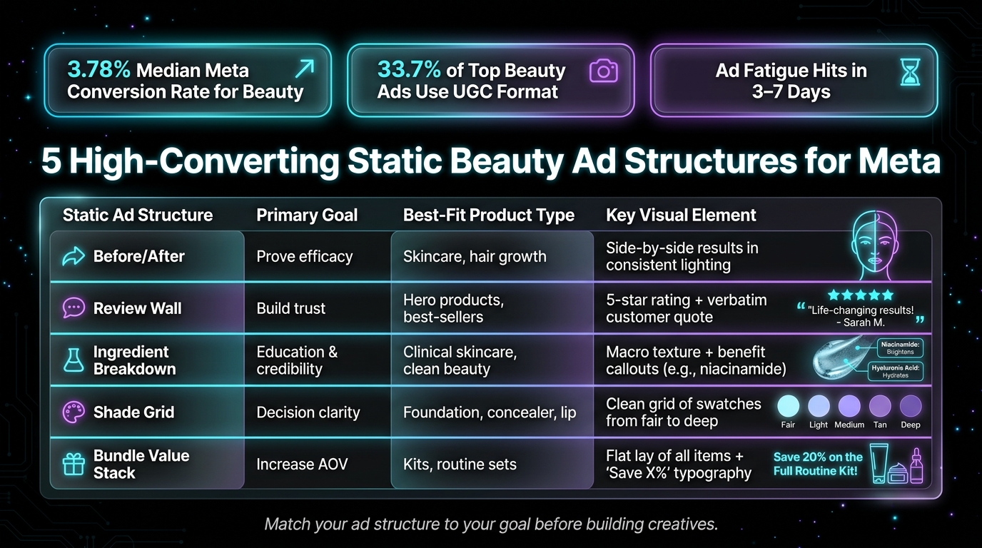
5 High-Converting Static Beauty Ad Structures for Meta
High-converting static beauty ads lean on four direct-response pieces: a strong hook, one concrete benefit, visible proof, and a direct offer. The hook needs to hit within 2 seconds. The benefit should be specific - "'Redness down in 10 minutes' beats 'glowing skin'". Proof helps calm doubt, whether that’s a star rating, a customer quote, or a real application shot. And the offer should push action with some urgency, like a bundle, starter kit, or free-shipping threshold. That’s what each prompt below is built to do.
UGC-style ads often beat polished studio images because they feel less like a campaign and more like a recommendation. That matters. 33.7% of the best-performing beauty ads use the UGC format. Creator-style images also tend to do better than polished studio shots for the same reason: they feel personal. Use realistic lighting, short text overlays, and macro close-ups so people can see how the product looks on skin. Keep primary text under 125 characters so it doesn’t get cut off on mobile, and keep headlines close to 5 words.
Meta creative can wear out within 3–7 days, which means testing speed matters just as much as the ad itself. ADEN's LAB helps by generating multiple algorithm-friendly static versions from one winning layout. So instead of rebuilding from zero every time, you can keep the format that works and test new spins on it.
Use the quick map below to match the right static ad structure to the goal before building the ads below.
| Static Ad Structure | Primary Goal | Best-Fit Product Type | Key Visual Element |
|---|---|---|---|
| Before/After | Prove efficacy | Skincare, hair growth | Side-by-side results in consistent lighting |
| Review Wall | Build trust | Hero products, best-sellers | 5-star rating + verbatim customer quote |
| Ingredient Breakdown | Education & credibility | Clinical skincare, clean beauty | Macro texture + benefit callouts (e.g., niacinamide) |
| Shade Grid | Decision clarity | Foundation, concealer, lip | Clean grid of swatches from fair to deep |
| Bundle Value Stack | Increase AOV | Kits, routine sets | Flat lay of all items + "Save X%" typography |
Put the playbook to work
Apply this playbook to your page
Paste your website and the Lab will turn the strategy you are reading into a ready-to-test ads.
Free to try No signup No prompt writing
1. Skincare Results & Transformations
Before-and-after ads have stuck around in beauty paid social for a reason: they show proof people can see. And in a crowded feed, that kind of proof can make someone pause for a second longer.
These skincare prompts take that idea and turn it into static ads built to stop the scroll.
Use compliant language throughout. Skip words like "cures", "heals", "treats", and "eliminates." Instead, go with phrasing like "promotes", "supports", "designed to," or "reduces the look of."
-
Day 1 vs. Day 14 Split-Screen
A static split-screen of the same person's skin: one image from Day 1, the other from Day 14 after using a niacinamide serum. Headline: "Visible change in 14 days." Overlay text: "Redness reduced in 14 days." Keep the lighting, angle, and background the same so the difference feels believable. -
Clinical Stat Callout Card
Use a clean white background with one bold stat in the center: "100% said skin looked calmer and less red." Add a small product shot and a short CTA. Simple works here. -
Post-Workout Wear Test
Use a creator-style photo shot in natural light after a workout, with the product still on and skin still looking fresh. Headline: "Still going." Overlay text: "8 hours later. Still going." This wear-test angle turns normal daily use into visible proof. -
Ingredient + Result Pairing
Show a macro close-up of a retinol cream texture. Headline: "Retinol." Overlay text: "Smoother-looking skin in 4 weeks." Pairing one ingredient with one clear result makes the message easy to grasp fast. -
Testimonial + Transformation Overlay
Use a product flat lay with a real customer testimonial placed over it in bold type. Focus on one specific result, like fewer fine lines or a smoother-looking finish. The quote should connect to a visible change, not just a vague reaction. -
"Before You Try It" Problem-First Card
Build a static card around two lines: "Dry patches every morning?" followed by "This moisturizer is designed to reduce the look of dry patches." Start with the skin concern, then give the benefit right away. Keep the visual clean: product on a neutral background, nothing extra.
Keep each card focused on one result, one proof point, and one visual.
2. Benefits, Ingredients & Texture
Shoppers can’t touch beauty products on a screen. So your static ads need to show feel, finish, and fit fast. The easiest way to do that? Let each card answer one doubt.
These prompts help turn texture into proof.
-
Macro Texture Hero Shot
Show a close-up swipe of a gel moisturizer on real skin in natural light. Overlay text: "Weightless. Non-greasy. Gone in seconds." This lets people judge stickiness, weight, and pilling in one glance. -
Hero Ingredient Callout
Use bold, centered text on a clean background: "Niacinamide 10%." Under that, add: "Niacinamide 10% for calmer, smoother-looking skin." Putting the active percentage front and center makes the formula feel more grounded and direct. -
The Objection Flip
Start with the pain point, then answer it. Copy: "Sticky SPF? This one absorbs fast - no white cast, no pilling." That problem-first setup grabs attention before the fix comes in. -
"Fit Cue" Skin Type Card
Use a split layout: product on one side, three short bullets on the other. Bullets: "For oily skin", "No white cast on deeper skin tones", "Hydrates without heaviness." This spells out who the product is for right away, which is often the first thing a shopper wants to know. -
Longevity Proof Card
Pair a clean product shot with one bold stat: "48-hour hydration." Keep that stat as the headline. A set results timeline helps answer the big question: does it actually work? -
Dispense Shot
Show the product mid-dispense, like a dropper releasing a serum drop or a pump pushing out foam. Overlay: "Silky. Lightweight. No drag." Seeing the formula in motion tells people a lot about viscosity and ease of use without leaning on technical jargon.
Once texture is clear, move to shade, finish, and fit.
3. Shade Range, Finishes & Personalization
Once you've nailed texture, the next choice is shade and finish. And this is where a lot of shoppers stall. If they’re not sure they’ll find the right match, they often won’t click at all. Static ads can ease that hesitation before the visit.
A few formats work especially well here:
- Inclusive Shade Grid Card: Show a clean grid with 40+ circular shade chips, from fair to deep skin tones. Let the range speak for itself. This format tends to work well for foundation and concealer campaigns.
- Undertone Swatch Split: Use a vertical split that shows cool, neutral, and warm swatches on one model. Label each column in a clear way so shoppers can spot their undertone fast.
- "If You Match" Decision Card: Use copy like: "If you match [well-known shade], try [your shade]." This cuts down on hesitation for shoppers who already know their shade in another brand.
- Signature Shade Hero: Put one standout shade front and center against a saturated background in that same color. Think red lipstick on a red background. Headline: "Your New Signature Red."
- Finish Comparison Card: Split the ad into two halves: matte on one side, dewy on the other. Add short labels like "oil control all day" versus "hydration/glow." That makes the choice easier and faster.
- Discovery Kit Prompt: Show a sampler or try-before-you-buy kit with copy like: "Not sure which shade? Try it at home before committing." This can lower the risk shoppers feel when buying shade-based products online, and it works well for warm retargeting audiences.
One small copy tweak can help, too: use "Your" in headlines and send clicks to a shade-finder quiz or tool.
sbb-itb-628c49f
4. Social Proof, Offers & Launches
Once shade, texture, and fit are clear, the next job is simple: remove doubt and give people a reason to act now.
At this stage, the product already makes sense. The shopper just needs that last nudge. That’s where social proof and offer framing come in. They help clear the final barrier between interest and purchase.
Use these 7 static ad prompts when you need proof, urgency, or both:
- Review Quote Card: Show a 5-star rating with a short, exact customer quote as the main visual. Specific quotes tend to work better than vague praise because they feel more believable and more useful.
- Stat + Review Card: Pair one bold metric with one customer quote on a clean background. Example layout: "94% saw results in 2 weeks" above a single-line review. This mixes clinical proof with a human voice.
- "Meet [Product]" Launch Card: Show the product with a bold "NEW" label and a short headline like "Meet [Product]." Use a high-contrast background so the label is easy to spot right away.
- All-Day Wear Proof Card: Show the product still holding up in heat, humidity, or under a mask. Overlay: "Through heat. Through humidity. Still on." This is different from a basic morning-to-afternoon wear test because it puts the focus on stress conditions.
- Bundle Value Card: Name the bundle and show the savings. Flat-lay all items together with a clear "Save X%" label. Keep it visual and let the offer speak for itself.
- Gift with Purchase Offer: Use clean, bold type to highlight a free add-on - "Free mini serum on orders above $X." This keeps the offer feeling premium while still giving shoppers a reason to move now.
- "Limited Run" Scarcity Card: For a seasonal or limited-edition drop, add an "Only X left" indicator or a short countdown. Keep the layout clean so the urgency is obvious at a glance.
For beauty ads, avoid before-and-after face claims. Lead with shade, finish, ingredient, or review-based proof instead.
Use these prompts to test proof-first, offer-led, and launch-led creatives fast.
Using ADEN's LAB to Turn Prompts Into Testable Static Ads
Take those prompt clusters and turn them into static ads you can actually test in ADEN's LAB.
Start by uploading your product URL. Then fill in five inputs:
- Hero benefit
- Audience
- Offer
- Proof
- Style
A simple example looks like this: reduced redness, women 30–55 with sensitive skin, 25% off a kit, a 5-star review or clinical stat, and a minimalist hero, UGC flat lay, or shade grid.
Use an 8-day cycle across prospecting, retargeting, and evergreen campaigns to keep ads from getting stale.
Begin with one cluster from the swipe file. Pick 3 to 5 concepts, export both 1:1 and 9:16 versions, and run them for 7 to 8 days. Then rank each one by CTR, CAC, and ROAS. Once you have a winner, move it into seasonal or evergreen campaigns. A strong evergreen ad can stay live for months.
Before anything goes out, zoom in to 100% and check each asset closely. Look for garbled text, warped product shapes, or fake trust badges, such as dermatologist-approved seals.
The table below shows how each prompt cluster lines up with the right ADEN's LAB inputs, funnel stage, testing cadence, and main metric.
| Cluster | Key ADEN's LAB Inputs | Funnel Stage | Testing Cadence | Primary Metric |
|---|---|---|---|---|
| Skincare Results | Benefit: reduced redness; Proof: clinical stat; Style: split-screen | Prospecting (cold) | Weekly | Thumbstop rate / CTR |
| Shade Range | Benefit: exact match; Proof: 40+ shade grid; Style: minimalist grid | Consideration (warm) | Bi-weekly | Qualified clicks / engagement |
| Social Proof | Benefit: wedding-proof; Proof: 5-star review; Style: UGC/testimonial card | Conversion (hot) | Weekly | CVR / CPA |
| Offers & Launches | Offer: 25% off kit; Benefit: value; Style: typography-led | Retargeting | Seasonal | AOV / ROAS |
| Ingredient & Texture | Benefit: non-irritating; Proof: dermatologist quote; Style: minimalist/clinical | Consideration (warm) | Monthly | Qualified clicks / engagement |
Conclusion
You now have 25 static Meta ad prompts for beauty and cosmetics brands. The next step is simple: turn them into tests, not just a pile of ideas.
The pattern is pretty clear across results, texture, shade, and proof: one benefit, one visual proof point, one action driver.
Use these prompts to test different angles and track CTR, CAC, or ROAS. Then take the ads that win and move them into a repeatable testing workflow.
You can do that inside ADEN's LAB as part of a repeatable testing system. Rotate angles, export 1:1 and 9:16 versions, and let performance data pick the winner. A strong evergreen static can stay live for months - winning evergreen beauty ads can average 212 days of active runtime. That’s how a swipe file turns into a testing system.
FAQs
Which static ad format should I test first?
Start with static formats first. They give you the fastest, lowest-cost signal for your creative strategy. And they let you test angles and layouts for less than video.
A smart first test is creator-style, UGC-inspired static images versus clean hero product shots. This gives you a simple head-to-head view of what clicks.
Once you see what performs best, take those winning ideas and scale them into higher-production formats like UGC video.
How many ad variations should I launch at once?
For new beauty campaigns, aim for at least 15 ad variants.
A simple way to do that is to mix three different hooks with three formats. Your hooks might focus on ingredients, common problems, or before-and-after style results. Your formats can include static images, carousels, and Reels.
For each pattern you test, make 3 to 5 versions. That gives you enough range to spot what’s working and what’s not.
If you test fewer than 15, it gets a lot harder to know what’s causing weak results. Is the audience off? Or are people just tired of the ad? With a bigger test set, that line becomes much easier to see.
What proof works best for beauty static ads?
The best proof for beauty static ads pairs real customer signals with clear, factual evidence. That mix helps build trust without making the ad feel stiff or overdone.
A few proof points tend to work well:
- Reviews and user-generated content with specific ratings or quotes
- Texture shots that show swatches, serum droplets, or how the product looks on skin
- Wear tests, shade grids, and expert validation, like dermatologist recommendations or ingredient concentrations
Steer clear of restrictive before-and-after transformations or wording that targets personal flaws.
Your next ad batch starts here
Finish with a ready-to-test ad batch
Paste your website to generate static creatives. Drop the link → get ads in about 90 seconds → upload them to Meta → scale.
Free to try No signup No prompt writing