Turn One Product Photo Into 15 Static Meta Ad Concepts
Build the ads while the examples are fresh
Turn your product page into static ad creatives
Paste your product URL and generate scroll-stopping images, headlines, and primary text—ready for your next Meta creative test.
No design brief or prompt writing required.
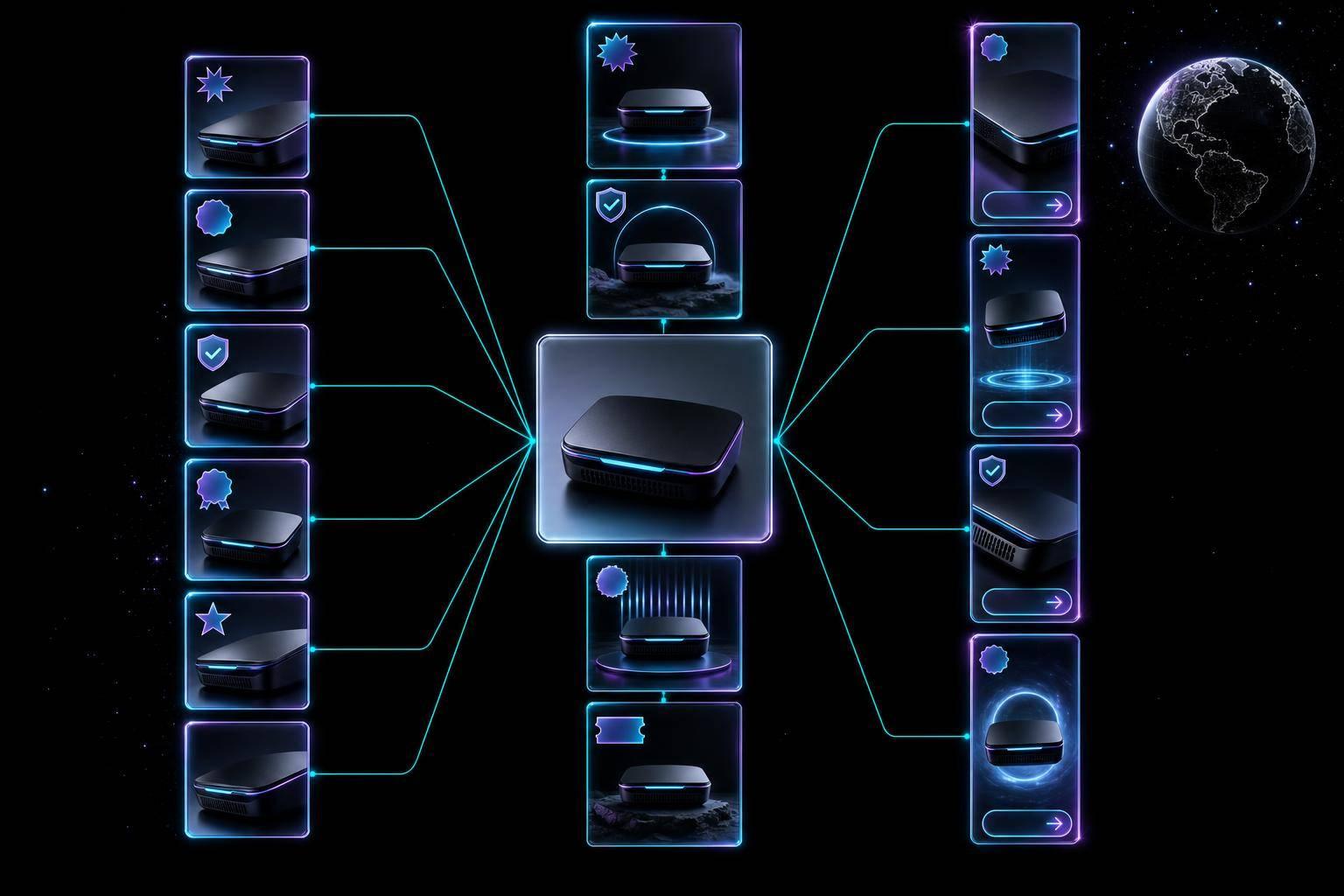
You do not need a new shoot to test more Meta ads. I can turn one clean product photo into 15 static ad ideas, then test them in a single batch across 1:1, 4:5, and 9:16 placements.
Here’s the short version:
- Static image ads made up 91.7% of 14,000+ analyzed ads
- The median winning static ad stayed live for 202 days
- In busy accounts, ad fatigue can show up in 3 to 7 days
- The fix is simple: keep the same photo, change the hook, proof, offer, and CTA
If I want more output from one image, I focus on:
- Cold traffic: founder, benefit, problem-first, meme, native-post styles
- Mid-funnel: testimonial, review collage, before-after, comparison, feature checklist
- Bottom-funnel: offer promo, urgency banner, placement versions of winners
What matters most is not the photo alone. It is how I frame it.
I start with one base image, prep it for all major Meta ratios, keep text light, and build each ad around four parts:
- Hook
- Product visual
- Proof point
- CTA
Then I turn that base into these 15 concepts:
- Founder POV
- Benefit-led spotlight
- Single testimonial quote
- Review collage
- Problem-first frame
- Before-after split
- Comparison frame
- Offer promo
- Urgency banner
- UGC-style static
- Meme hook
- Native post style
- Feature checklist
- Brand billboard
- Placement variants
How I Create New Meta Ad Concepts at Scale Using AI (Full Workflow)
sbb-itb-628c49f
Quick comparison
| Concept group | Best use | Main goal |
|---|---|---|
| Trust and problem angles | Cold audiences | More clicks and attention |
| Proof and value angles | Warm audiences | More site visits and stronger intent |
| Offer and urgency angles | Hot audiences | More purchases or leads |
| Placement variants | Winners only | Better fit by placement |
My takeaway is simple: one product photo can support a full test cycle if I change the message, not the asset. I use the first data read to cut weak ads, keep the winners, and make more versions from the angles that work.
Build the Base Asset and Copy Framework First
Prepare the Photo for Feed, Stories, and Overlay Use
Start by cropping and exporting the same product photo in 1:1, 4:5, and 9:16. That gives you versions for feed, mobile feed, and Stories, so one photo can do a lot of work without another shoot.
Before you export, check the negative space. You want a clean area for overlay text, and you want to cut out background mess where you can. Also keep text on the image under control. Images with less than 20% text tend to do better for reach and engagement on Meta.
Set up promo language in U.S. format from the start, like $29.99, 20% off, or Ends Sunday, July 27.
These exports are the base for every concept below.
Write the 4 Parts Every Static Ad Needs
Every static ad needs four parts: hook, product visual, proof point, and CTA.
The hook should come from one customer problem. The proof point should come from one real review or rating. Then use just one CTA for each concept:
- "Shop Now" for purchase ads
- "Learn More" or "Get Quote" for lead gen
Set these four pieces once, then remix them across your 15 concepts instead of starting over every time.
Use this framework to shift the angle without changing the core asset.
Match Concepts to Campaign Goals Before Designing
Match each concept to the funnel before you start designing. That way, you pick the right ad type for the job instead of forcing one idea into every stage.
| Concept Type | Funnel Stage | Primary KPI Focus | Use Case |
|---|---|---|---|
| Benefit-Led | Cold (Top) | CTR / Awareness | Highlighting a unique product feature |
| Problem-First | Cold (Top) | CTR / Engagement | Addressing a specific pain point |
| Testimonial | Warm (Middle) | Conversion Rate | Social proof card with a 5-star review |
| Comparison | Warm (Middle) | Consideration | Side-by-side value demonstration |
| Offer-Led | Hot (Bottom/Retargeting) | ROAS / Purchase | "20% Off" or time-limited promo |
| Urgency/Scarcity | Hot (Bottom) | Conversion Rate | "Ends Tonight" or "Limited Stock" banner |
With the base asset and copy rules set, move into the 15 concepts below.
Turn One Product Photo Into 15 Static Meta Ad Concepts
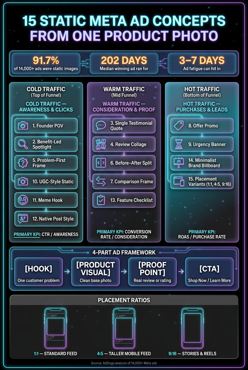
15 Static Meta Ad Concepts From One Product Photo
Concepts 1–5: Founder, Benefit, Testimonial, Review Collage, and Problem-First
You don’t need 15 different product shoots to test 15 ad ideas. One strong product photo can do a lot of work if you change the overlay, framing, and emotional angle.
Concept 1 - Founder POV: Add a short first-person line and keep the branding clean. This works well for cold traffic.
Concept 2 - Benefit-Led Spotlight: Put a three-word benefit headline in the negative space. Think Lasts All Day or Ships in 24 Hours. It should be short, direct, and easy to read in a split second.
Concept 3 - Single Testimonial Quote: Use one real customer quote with a specific result, then pair it with a star rating that feels honest. This is a good fit for warm audiences that want a little proof before they buy.
Concept 4 - Review Collage: Place three to four short reviews around the product image. Keep each review to one sentence so the layout doesn’t get messy. This works best for people who already know a bit about the product.
Concept 5 - Problem-First Frame: Start with the pain point, not the product. Lead with a headline built around a specific problem state, then let the product sit in the frame as the answer.
Concepts 6–10: Before–After, Comparison, Offer Promo, Urgency Banner, and UGC-Style Static
Once you’ve tested trust angles, move into proof and conversion. These five are built for mid- to bottom-funnel testing.
Concept 6 - Before–After Split: Split the image into two halves: before on the left, result or product on the right. Label both sides so the contrast is instant.
Concept 7 - Comparison Frame: Use an "Old Way vs. New Way" setup. On the left, show the frustrating generic option. On the right, show what your product does better. This is a solid mid-funnel comparison angle.
Concept 8 - Offer Promo: Add a bold price badge in the corner, like $29.99, Save $10, or 20% Off, and pair it with Shop Now. This one is built to drive purchases.
Concept 9 - Urgency Banner: Add a thin banner with a deadline or low-stock note on top of the offer promo. That makes it more bottom-funnel and more conversion-focused.
Concept 10 - UGC-Style Static: Use a looser crop and a caption-style overlay so it feels more like an organic post than a polished ad.
Concepts 11–15: Meme Hook, Native Post Style, Feature Checklist, Minimalist Brand, and Placement Variants
From here, shift into native-feeling formats that can stop the scroll without looking too polished.
Concept 11 - Meme Hook: Put a relatable headline over the product photo in a bold, high-contrast font. Use this for awareness and engagement.
Concept 12 - Native Post Style: Make the ad look like a normal Instagram or Facebook post. Add a username-style handle, a like count, and a short caption under the image.
Concept 13 - Feature Checklist: Build a short checklist of three to five product features around the image. Use checkmarks, short phrases, and enough white space so it stays easy to scan. This works well for SaaS and lead generation brands when the offer needs a bit more detail. Pair it with a Learn More CTA.
Concept 14 - Minimalist Brand Billboard: Strip it down to the product photo, brand name, and one tagline. This works well as a clean support ad next to more detailed ads.
Concept 15 - Placement Variants: Resize the winning concept into 1:1, 4:5, and 9:16. That turns one winning concept into placement-ready ads without changing the main idea.
"A winner makes a single promise: one hook, one benefit, one CTA." - AdDogs
| Ratio | Placement | Why It Matters |
|---|---|---|
| 1:1 | Standard Feed | Works across Meta platforms |
| 9:16 | Stories & Reels | Full-screen vertical format for mobile viewing |
| 4:5 | Taller Mobile Feed | Takes up more screen space on mobile than 1:1 |
Scale Production With a Repeatable Workflow
A Simple 5-Step Workflow From Photo to Ad Set
Once the 15 concepts are mapped, the next job is turning them into files your team can use fast. The easiest way to do that is to batch the work in one session so all 15 concepts are exported together.
- Source your base photo and prep it for multiple ratios
Crop and resize your product photo for 1:1, 4:5, and 9:16 before you start building any concept.
- List your angles before you open a design tool
Write the hook, benefit, proof element, and CTA for each of the 15 concepts first. Match each one to the concept type you already picked.
- Build in batches by concept type
Group concepts by archetype and angle, then design similar versions together. For example, you can batch problem-solution, social proof, and offer-led concepts in the same work session. That keeps the layout logic steady and cuts down on context switching.
- Run a QA pass before exporting
Check spelling, verify claims and badges, and make sure the product shape still looks clean at 100% zoom.
- Export placement-ready files and upload them together
Name files by concept and ratio so your team can swap and compare them fast. This is the part where automation does the most heavy lifting.
"Static is the format that lets you answer that [creative fatigue] cheaply." - AdDogs
Where ADEN's LAB Fits In for Faster Static Ad Output
ADEN'S LAB can generate static Meta ad variants from a product image or landing page link in under 90 seconds. You get founder, testimonial, comparison, problem-solution, and offer-led options in one batch.
How to Keep Ad Volume High Without New Shoots
A single product photo can support a lot of testing if you swap the hook, proof, or offer. On high-velocity accounts, Meta creative can fatigue in as little as 3 to 7 days.
That’s where ADEN'S LAB fits well. It’s built for repeat production, so teams can make new variants without going back to a shoot or rebuilding each ad from zero. Once the variants are exported, the next move is to test them against each other with one variable changed at a time.
Test the 15 Concepts and Keep the Winners
Run a Clean Concept Test Before Changing Too Many Variables
Once the 15 files are exported, test them as one controlled batch. Keep the audience, placement, and budget the same across all 15 ads. That way, the main thing you're testing is the creative angle.
Watch these metrics closely:
- CTR
- Cost per result
- Conversion rate
- Early fatigue
If one concept starts pulling ahead with a clear CTR edge and lower costs, cut the weaker ads fast. You're not trying to polish every ad in this batch. You're trying to figure out which ideas are worth making more of.
Use a Comparison Table to Review Concept Performance
Once early data starts coming in, it helps to review all 15 concepts side by side. That's usually where patterns start to show up. You can see which angles get clicks, which ones drive conversions, and which ones stall out.
| Concept | Primary Angle | Early Winner Signal | Scale Next |
|---|---|---|---|
| Founder | Story/Trust | Strong CTR on cold traffic | More first-person hooks |
| Benefit | Direct Value | High CTR, low cost per click | More benefit headlines |
| Testimonial | Social Proof | High conversion rate | More quote variations |
| Review Collage | Social Proof | Strong mid-funnel CVR | More multi-review layouts |
| Problem-First | Empathy | High CTR on cold audiences | More pain-point hooks |
| Before–After | Transformation | Strong engagement and CVR | More result-focused splits |
| Comparison | Logic/Value | High consideration rate | More side-by-side formats |
| Offer Promo | Incentive | High purchase rate | More price/offer variants |
| Urgency Banner | Scarcity | Strong BOF conversion | More deadline overlays |
| UGC-Style | Authenticity | High CTR, low CPM | More organic-feel crops |
| Meme Hook | Humor | High engagement rate | More relatable headlines |
| Native Post | Non-disruptive | Low CPM, steady CTR | More caption-style formats |
| Feature Checklist | Education | Strong MOF CVR | More checklist layouts |
| Minimalist Brand | Aesthetic | Low CPM, brand recall | More stripped-back variants |
| Ratio Variants | Placement fit | Improved delivery efficiency | More placements per winner |
This table isn't about building a perfect ad set. It's there to help you isolate the small group of concept families that deserve another round. Once you know the winners, build more variants inside those lanes.
Conclusion: One Asset, Many Ad Angles, Faster Testing
One strong product photo, a clear hook-proof-CTA structure, and 15 distinct concepts can give you a solid creative bank without booking another shoot. The range comes from the angle, the overlay, and the framing - not from changing the photo.
Use the 3–7 day testing window to cut slow concepts fast and put more budget behind what works. In a study of 14,000+ winning ads, 64.3% ran for 180 days or longer, so finding even one strong concept from this batch can keep paying off for months. The job here is simple: find the winning angles from one photo, then make more versions from those winners.
FAQs
How do I choose the best 15 angles from one product photo?
Go for variety, not tiny changes. Pick a mix of tested ad styles, then label each concept by angle and layout so you can compare results and reuse what works best.
- Angle: problem-solution, social proof, offer-focused
- Layout: clean background, product-in-use, split-screen, testimonial card
Also, match your photo’s lighting and camera angle to your references so everything looks consistent.
Which static ad concepts work best for cold, warm, and hot audiences?
For cold audiences, lead with problem-solution ideas and benefit-led visuals so people can grasp the value fast. They don't know you yet, so the message needs to do the heavy lifting right away.
For warm audiences, lean on social proof and testimonial overlays to build trust. At this stage, people are aware of you. What they need is a clear reason to believe.
For hot audiences, put offer-led promos and direct comparisons front and center to help push the final buying decision. Tagging creative by angle also makes it much easier to test the right concept at each step of the customer journey.
How should I test these static ads without changing too many variables?
Test proven angles that are clearly different instead of making tiny edits to one idea. Each week, compare a few distinct versions - like a problem-solution format against a social proof angle - instead of running a bunch of near-identical ads.
Keep the core layout the same by cloning structures that have already worked. That way, you can isolate the angle and see what's actually driving performance. If a clone beats your control, put more budget behind it.
Create Ads That Print Money
Your competitors aren't waiting — why should you? Drop your product link → get scroll-stopping ads in 90 seconds.