
ADEN'S LAB
Best in set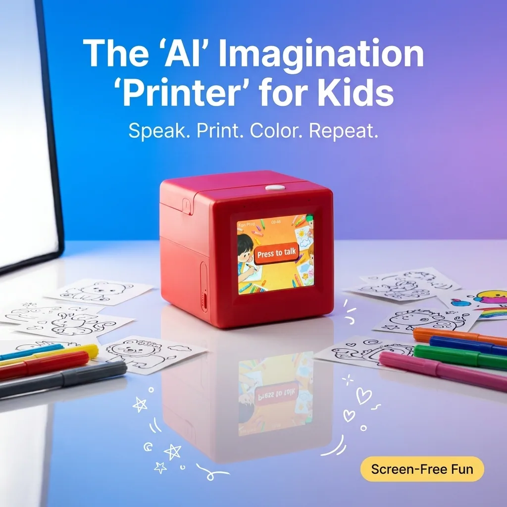
One clear promise, a credible product scene, and enough open space for the ad to read on a phone.
Same inputs. Nine finished outputs.
We compared ADEN'S LAB, GPT, and Gemini across three products. ADEN'S LAB wins this creative-readiness test with the clearest selling angles and the lowest editing burden.
Published and last checked July 31, 2026


The complete output set
The full nine-ad test is below. Compare each finished output exactly as it came from the generator.
A children's voice-to-sticker printer product page.
WinnerADEN'S LAB produced the cleanest ad concept. The product, promise, and use case register in one glance.
One clear promise, a credible product scene, and enough open space for the ad to read on a phone.
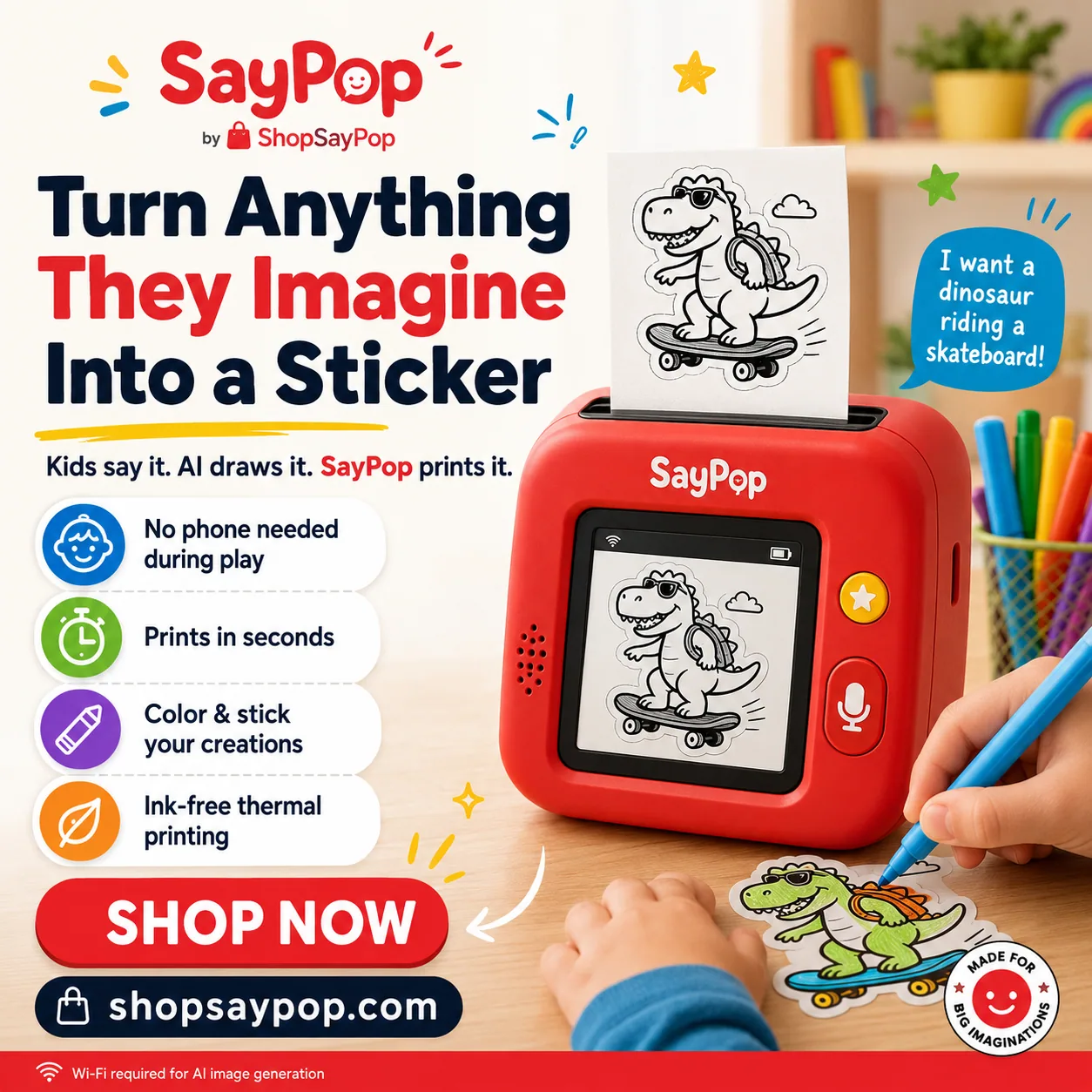
The product explanation is strong, but the number of badges, borders, and repeated claims makes the first read harder.
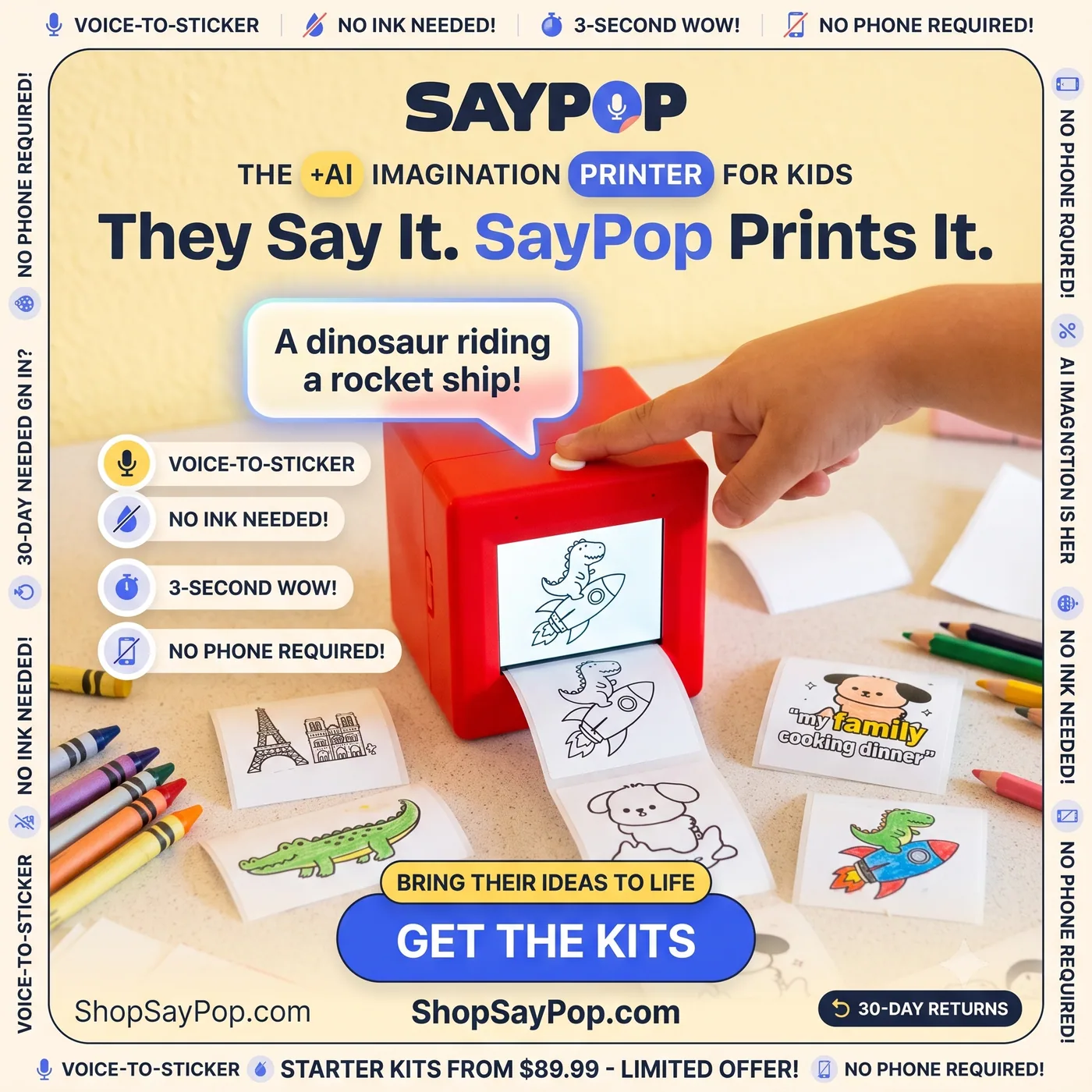
It explains the mechanism, but the frame repeats the same claims and asks the viewer to process too much at once.
A portable, interchangeable bowl system product page.
WinnerADEN'S LAB found the strongest thumb-stop: a real person, a clear reaction, and the product in hand.
The human reaction makes the product feel discovered instead of catalogued. The line lands quickly and the CTA is obvious.
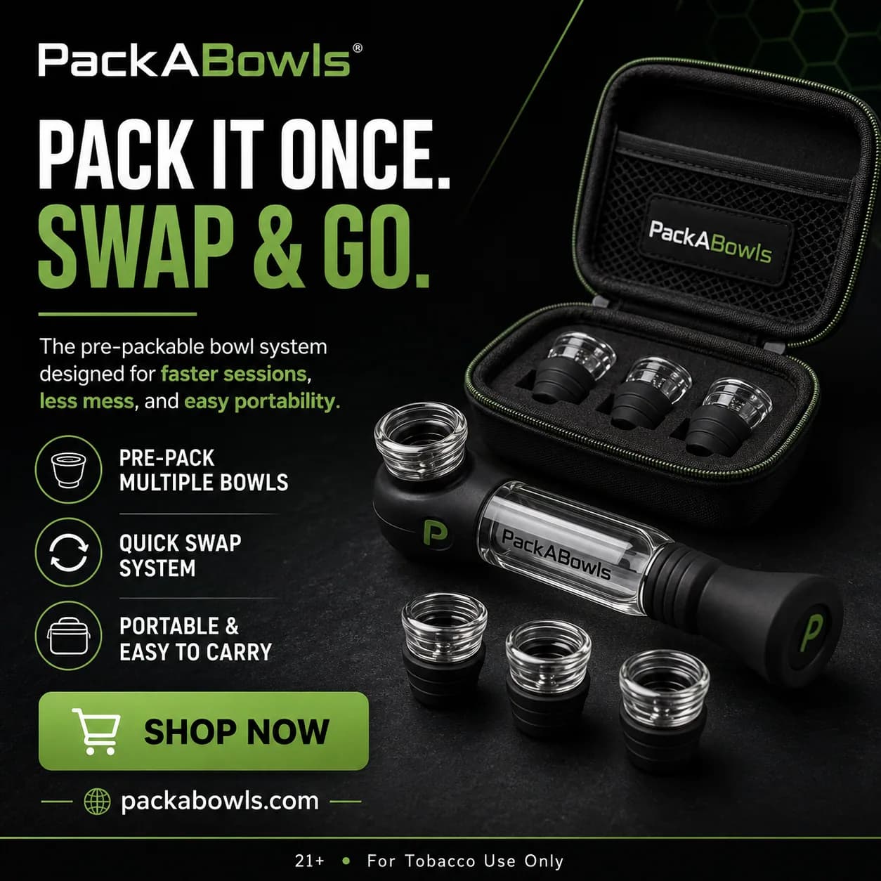
A polished product ad with strong hierarchy. It is usable after checking every depicted part and product claim against the source page.

The mechanism is visible, but the broad headline, dense feature list, and generated product details add review work before launch.
An online skills and education membership product page.
WinnerADEN'S LAB built the clearest outcome-led ad. The milestone, product context, and next action work as one unit.
It leads with a specific transformation, uses a credible creator-style scene, and finishes with one direct CTA.

The brand and offer are prominent, but the amount of copy, badges, pricing, and screen detail creates a crowded mobile read.
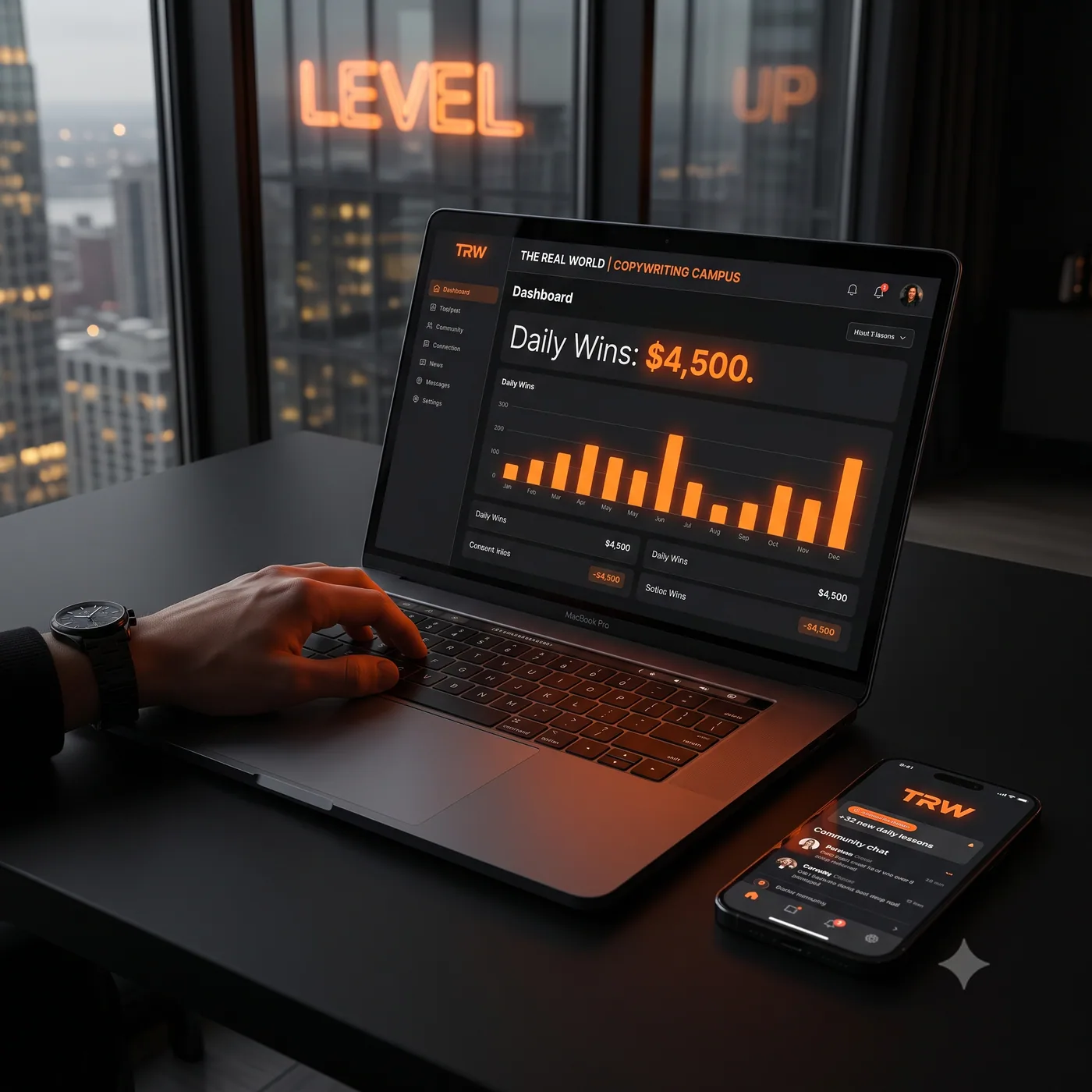
The scene looks polished, but it behaves more like a product visual than a finished ad. It also introduces a dashboard result that requires verification.